A father-son operated business needed a logo that represented their mission statement: Provide truly specialized designed and custom built cabinetry. They strive to appeal to clients with disposable income who want unique furniture in their homes.
Their high quality standards for craftsmanship consist of research, planning, measuring, cutting, building and finishing each project all on-site. I decided to play with the idea of "pillars from a palace" as a focal point for their logo.
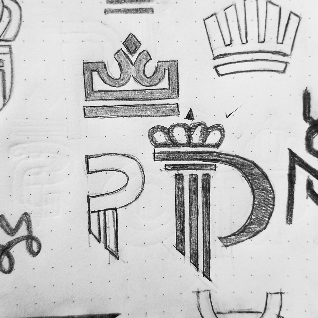
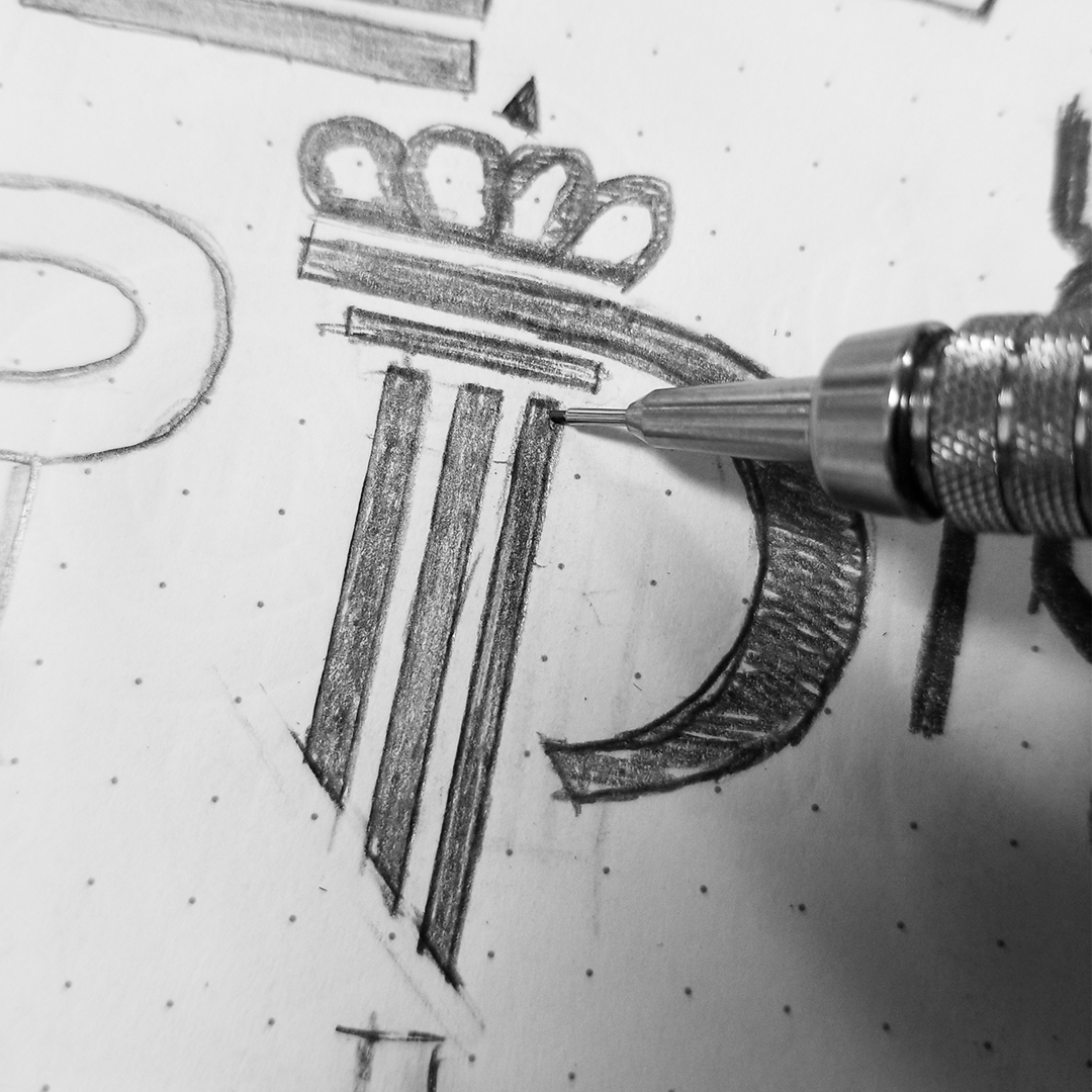
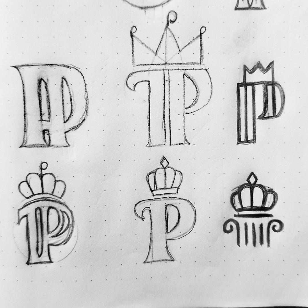
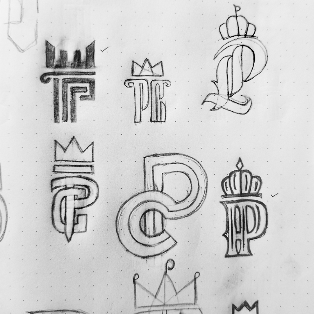
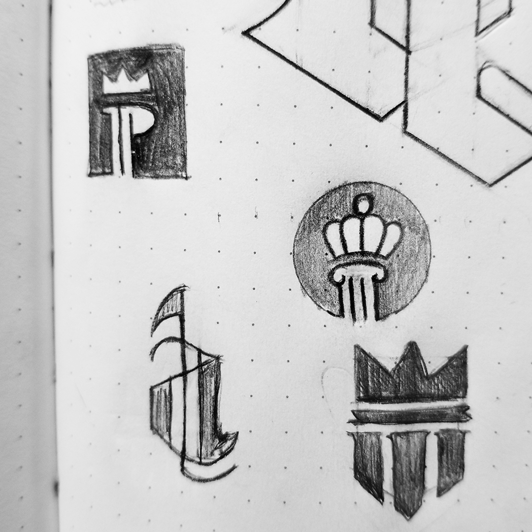
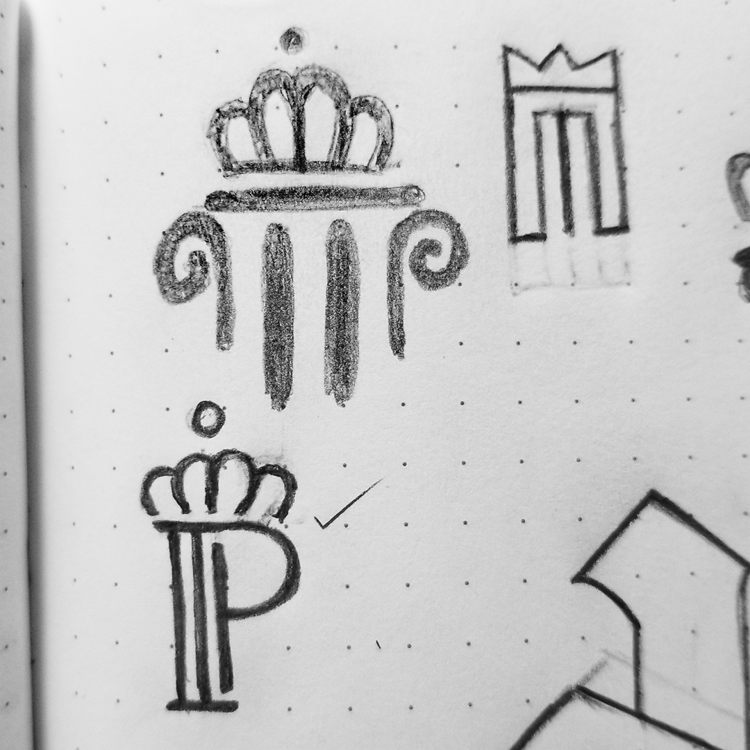
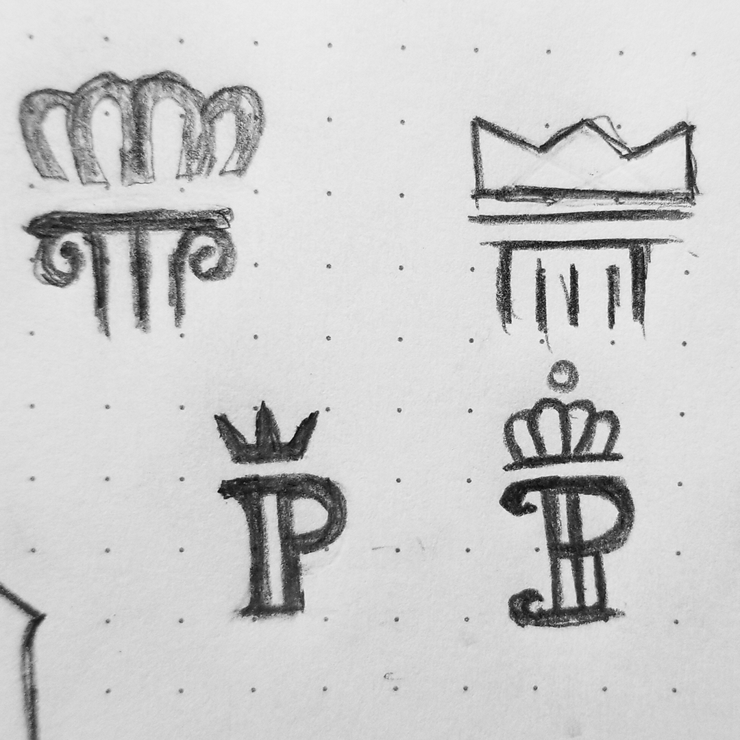
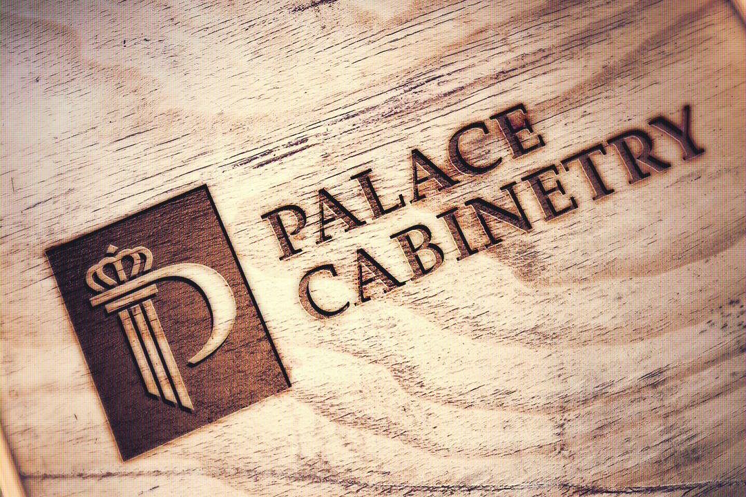
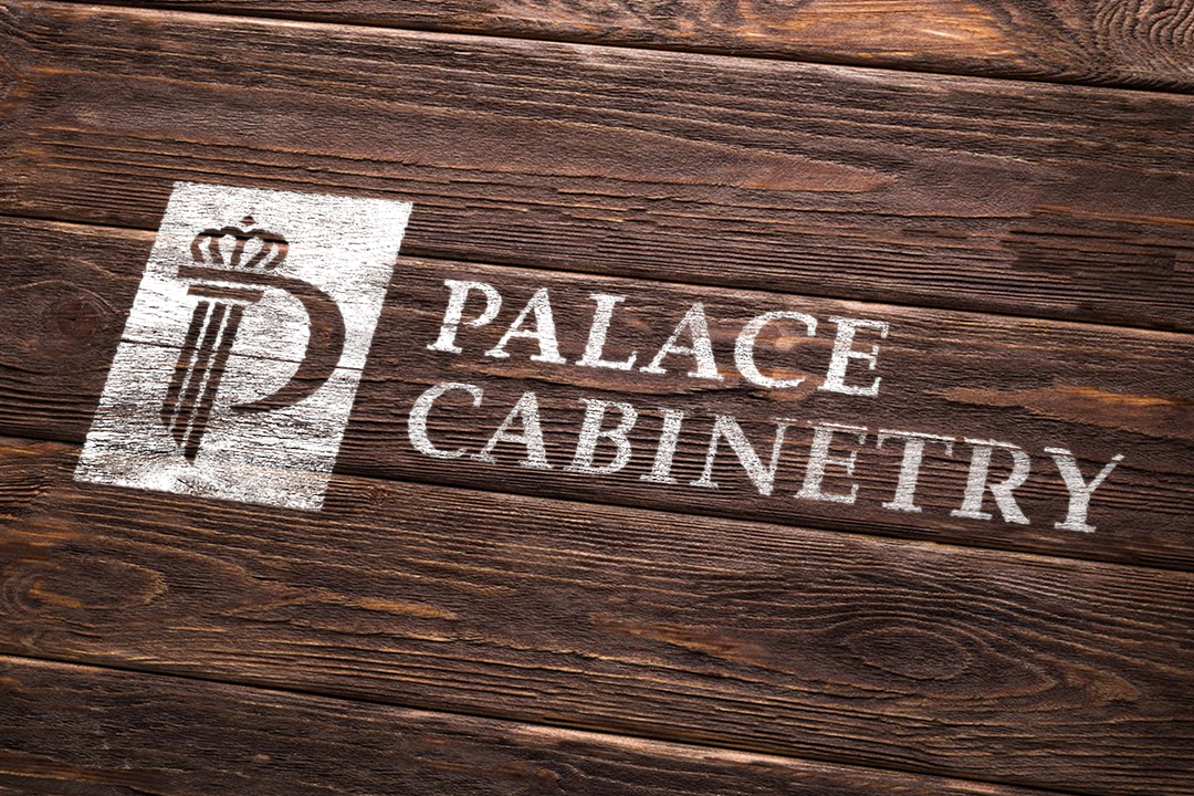
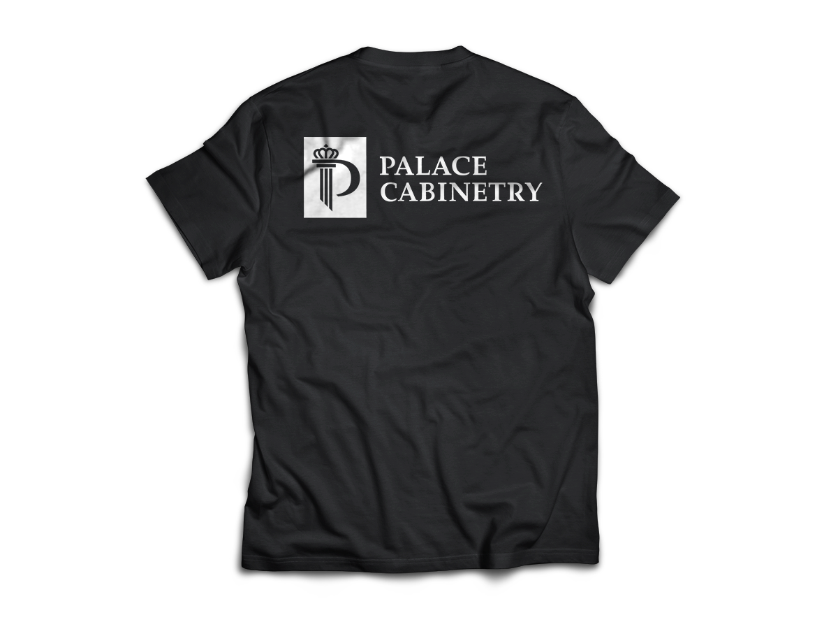
Combined with the letter "P" is an icon of a pillar that represents this company as a reliability for providing the best cabinetry service for their community in San Diego, California. The reason for having each stem of the pillar diagonally cut is to project the idea of using a saw, which as we all know, is one of the most important tools in this industry.
The crown derives from their Spanish last name, Reyes, that translates to "king" in english and serves as a symbol for unmatched competence. The vertical rectangle shape surrounding the pillar depicts a simple cabinet and ties the pillar design together.
The custom serif font compliments the logo mark with its contrasting stroke weight and clear legibility. It contains elements from the logomark such as each stem of the logomark's pillar being the same width as the stems of each letter in the name. The deep red color resembles the traditional and popular mahogany hardwood.
*Mock-Up Assets edited but not owned by me.


