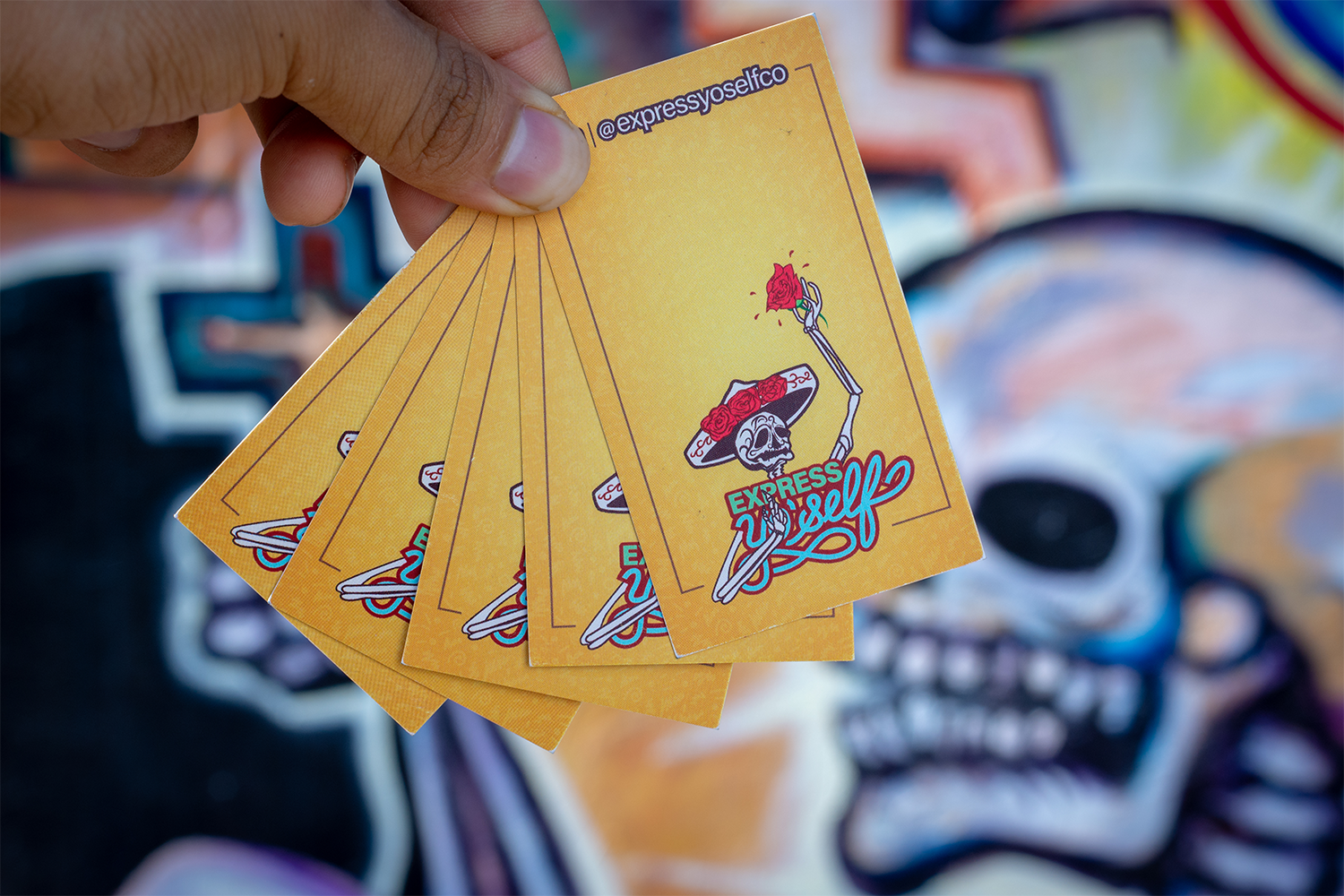
A nostalgic feeling. An expressive attitude. A fun brand! These are what ExpressYoSelfCo is all about. Antony Ly was looking for a logo to represent the whimsical identity of his company.
It's a company that sells primarily pins and t-shirts. We talked about 90's typography and color pallets and script typefaces. He wanted something fresh and elegant. I researched 90's posters and found inspiration in MTV's brand. So I grabbed my pencil and started my creative process.
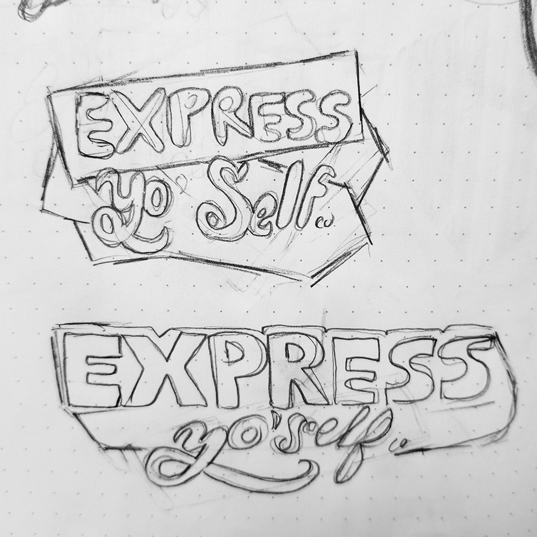
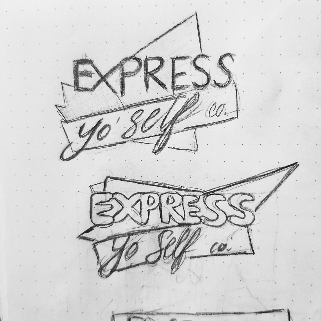
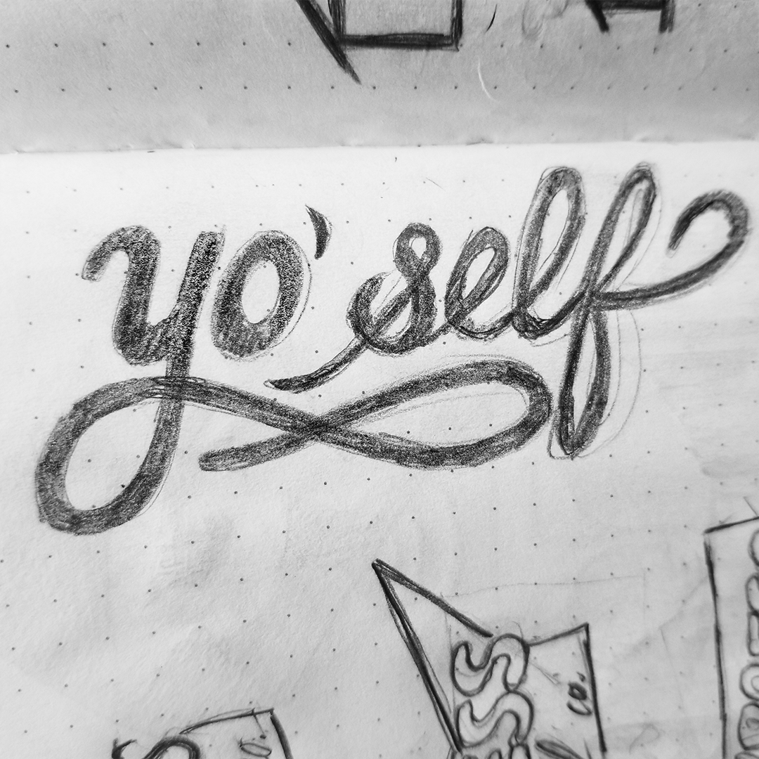
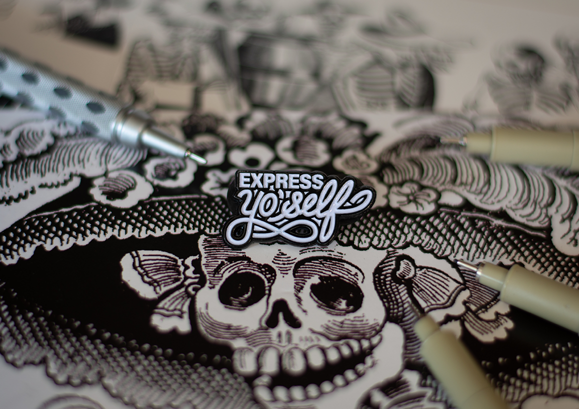
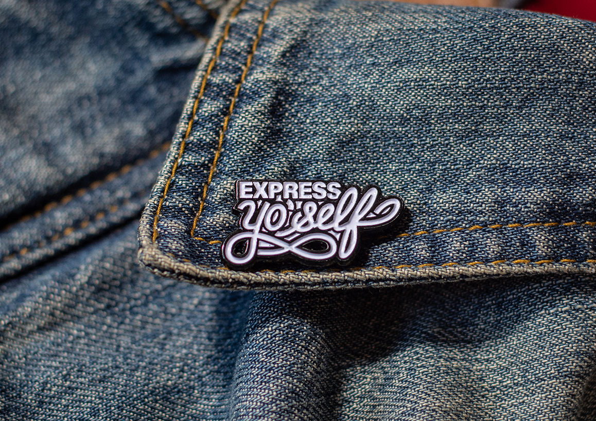
The result is a fluid script based wordmark. The "express" word is a bold all-caps Arial font variant that fills the space above the cap-height of the cursive "yo' self". Their balance and structure compliment each other's style. The 'Y' in "yo' self" has a swash to add visual interest. It ultimately conveys a message of having fun with expressive typography.
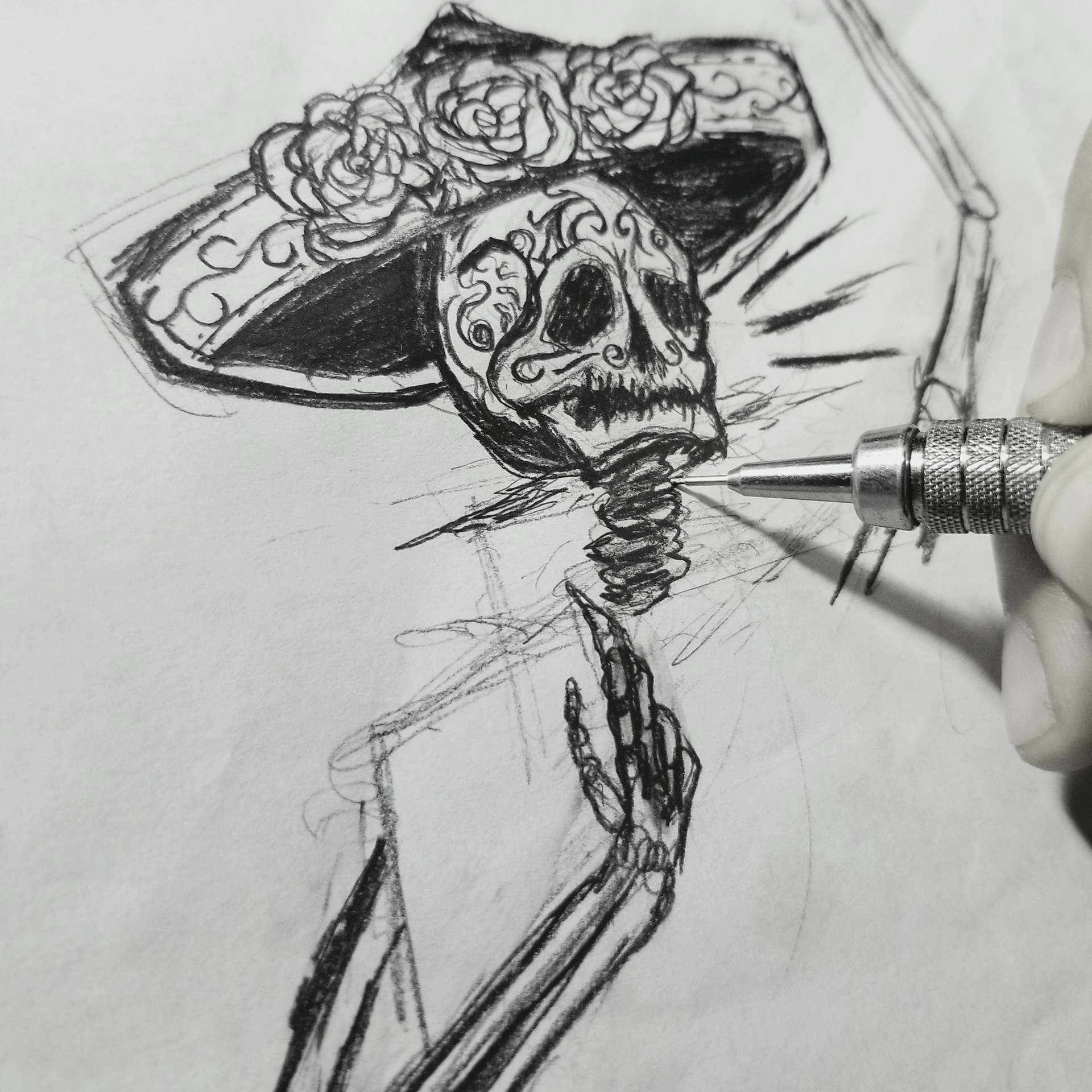
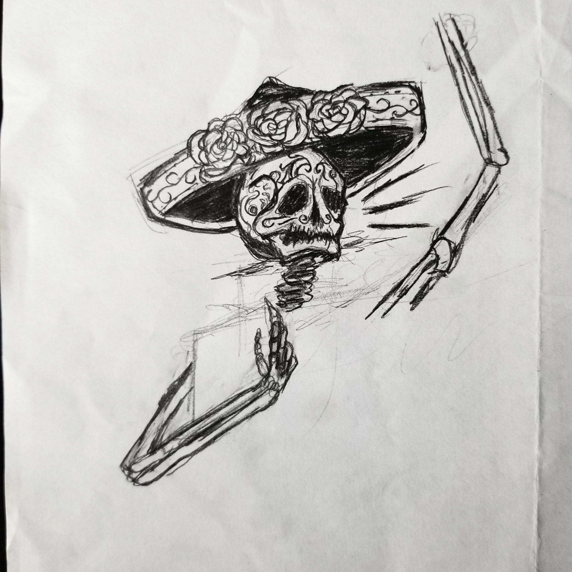
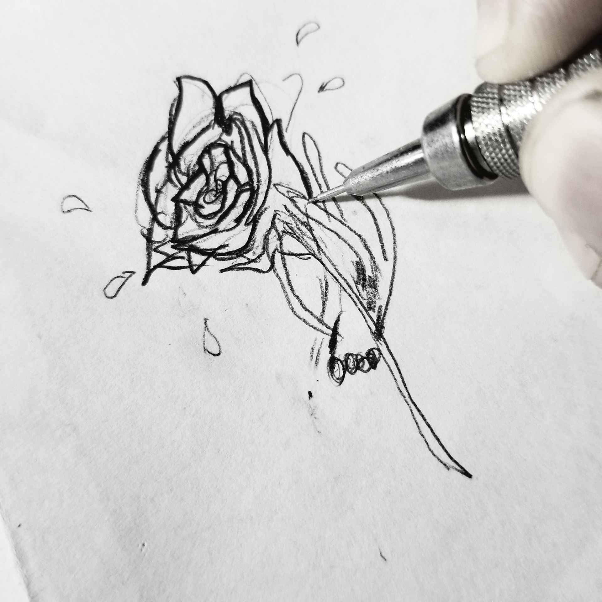
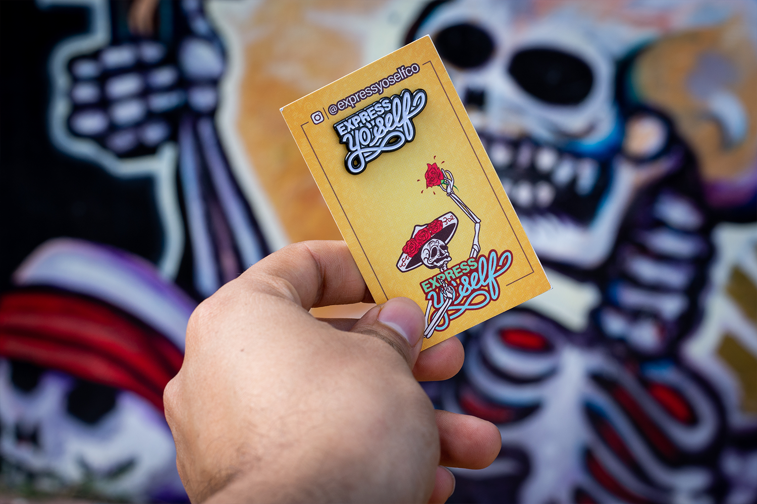
As Day of the Dead approached, Antony wanted a pin design to reflect the Mexican holiday. I had an idea of having a skeleton wearing a sombrero while holding up a rose. It was a fun experience implementing the sugar-skull style into this design because it had to reflect the folk art style of colorful icing and sparkly tin and glittery adornments.
