Created in the mid 1990’s Mexico City club scene, Milagro Tequila strives to express their roots through their miracle-tasting beverage.
A brand with bold marketing strategies deserves a logo to uphold its integrity. These tactics include specially designed bottles that represent the modern architecture of Mexico City and collaborations with graffiti artists like Miguel “Nuezz” Mejia , Seher One, Lelo, and Spaik to create street-art inspired murals and marketing materials.
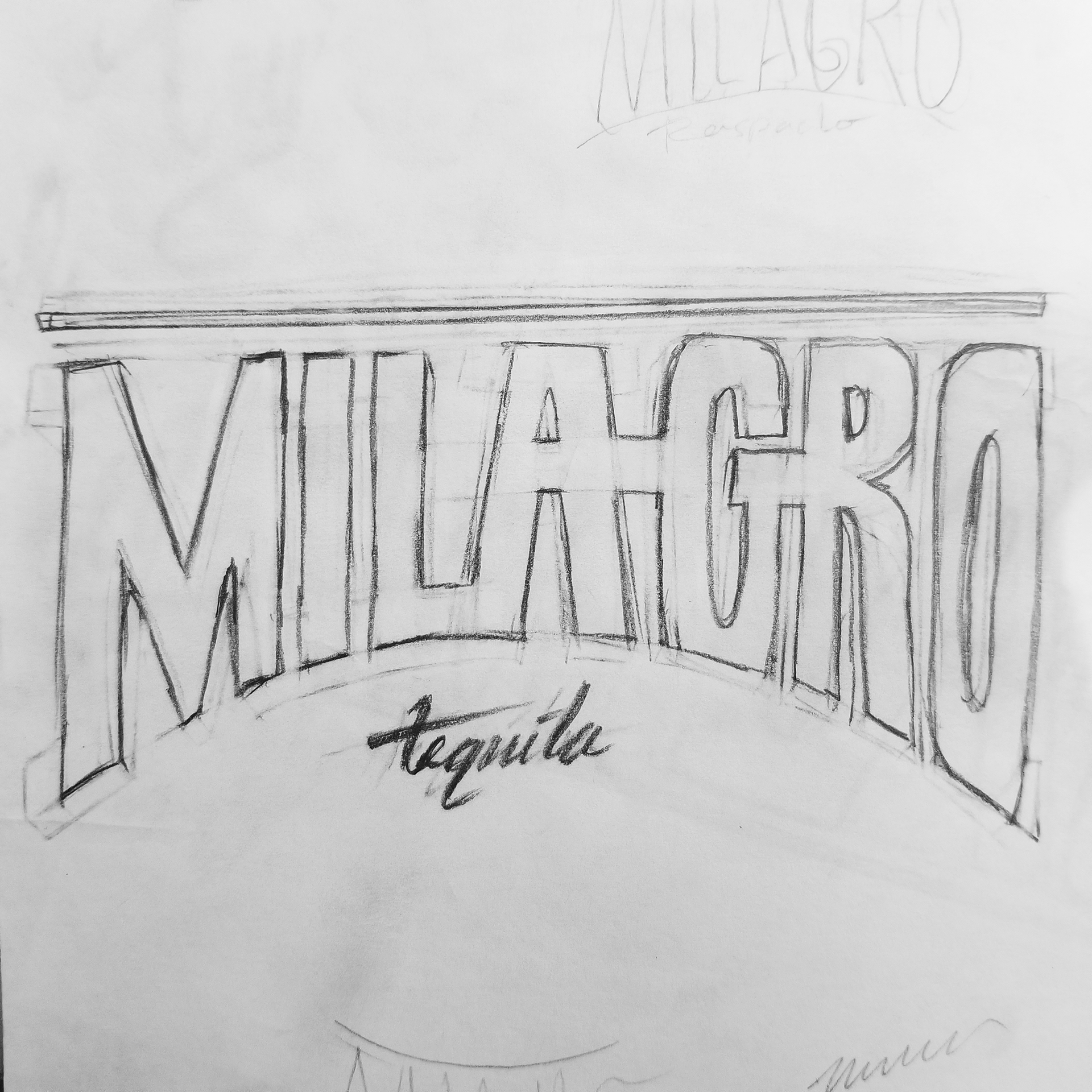
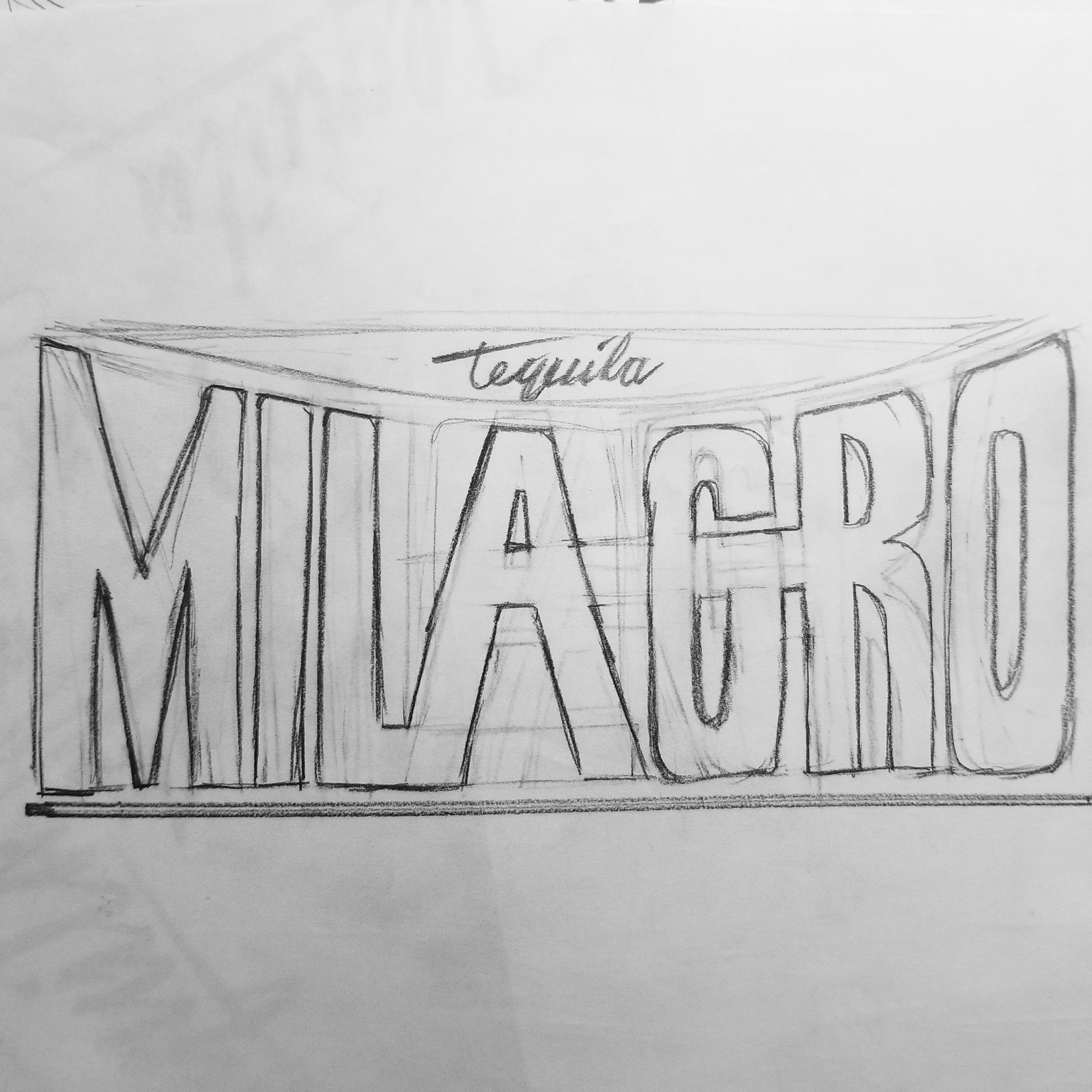
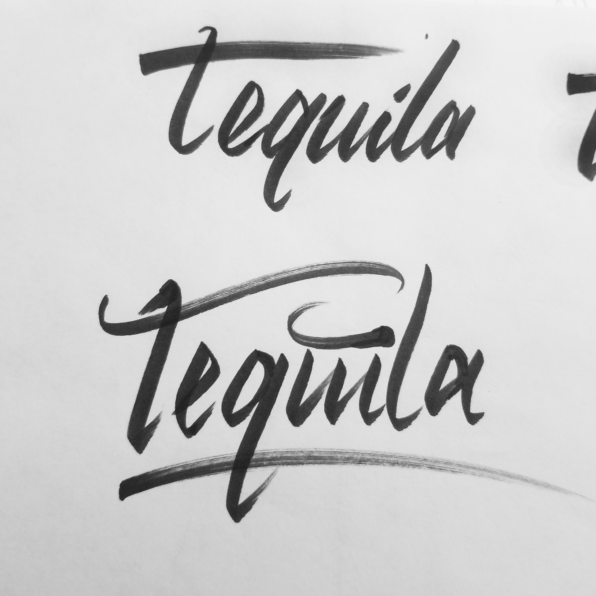
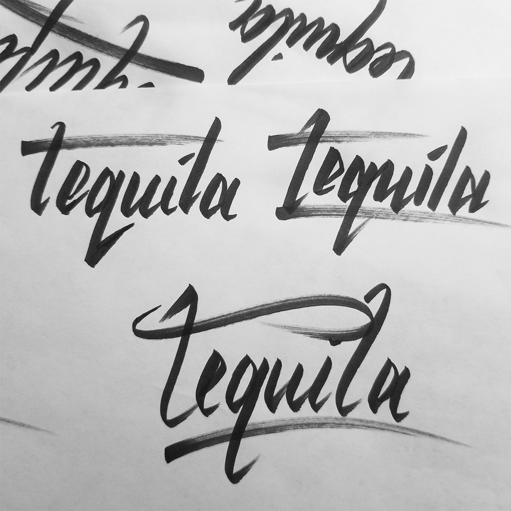
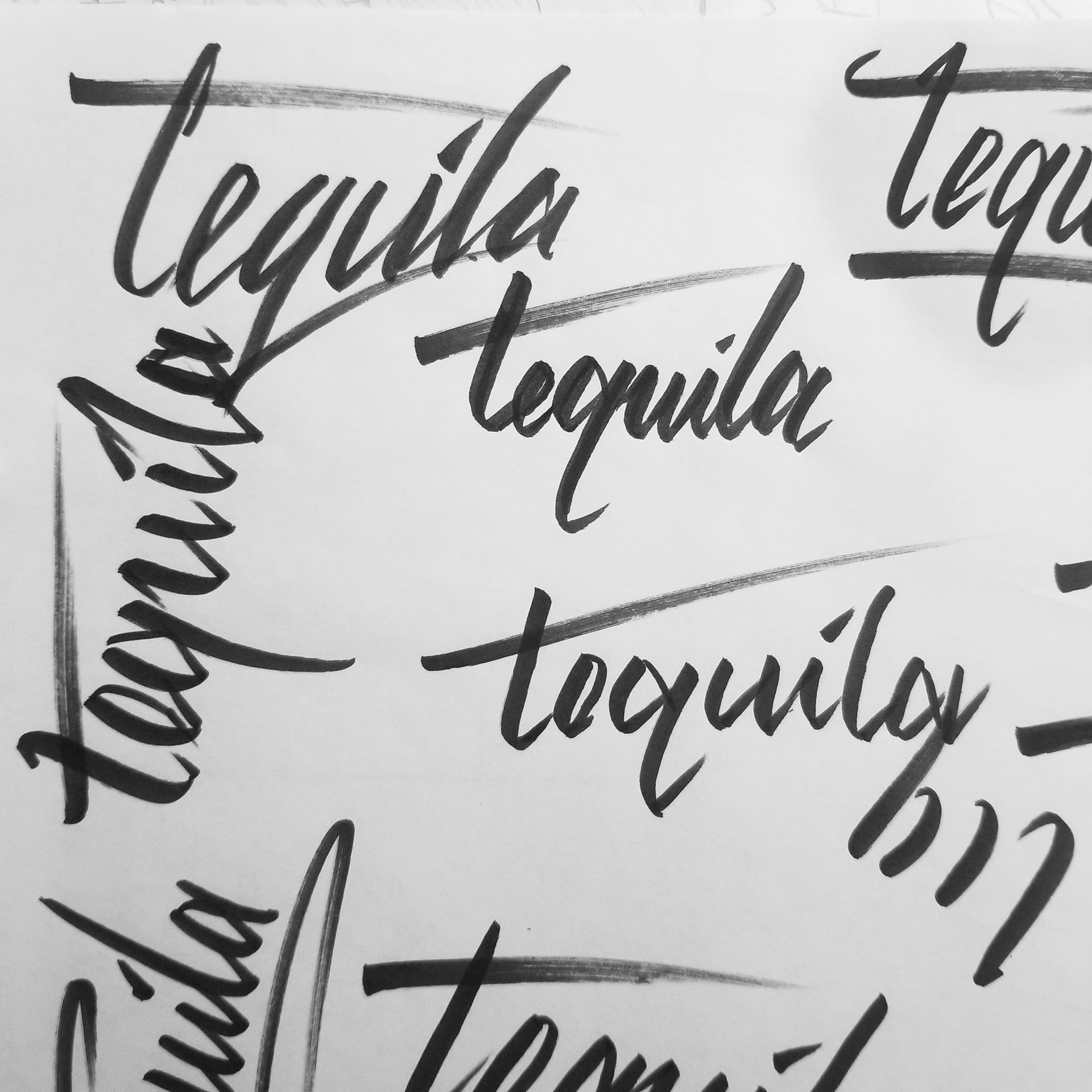
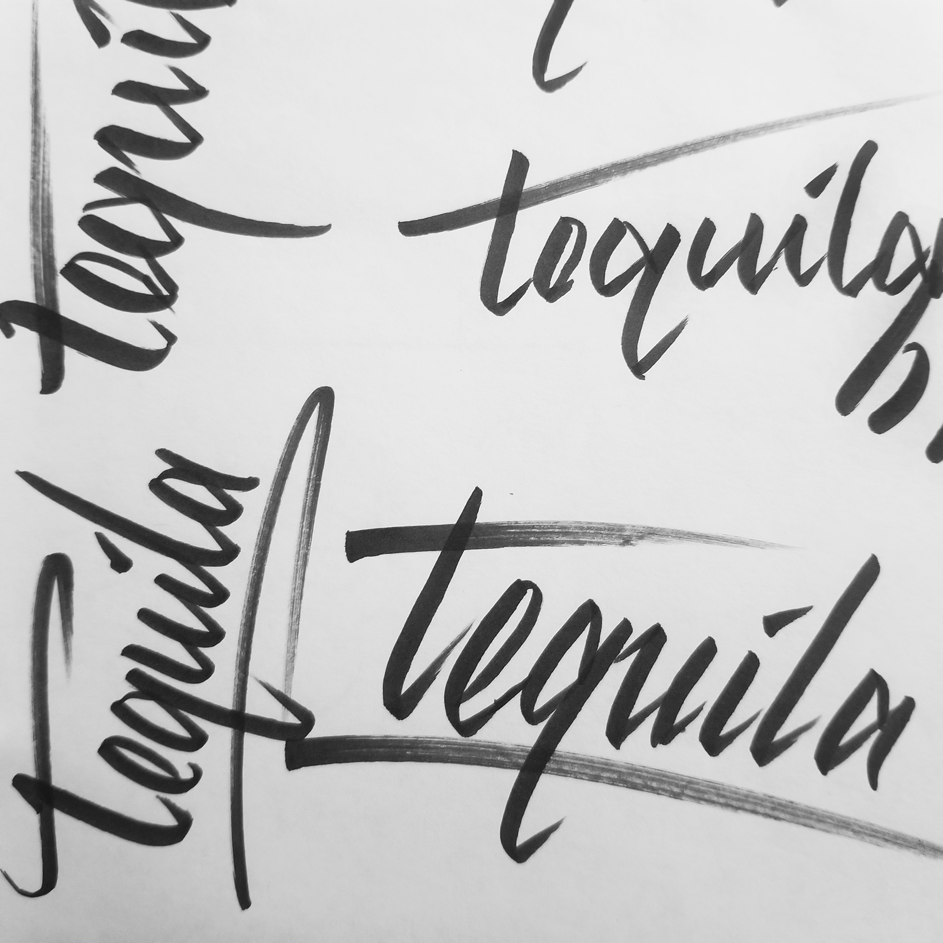
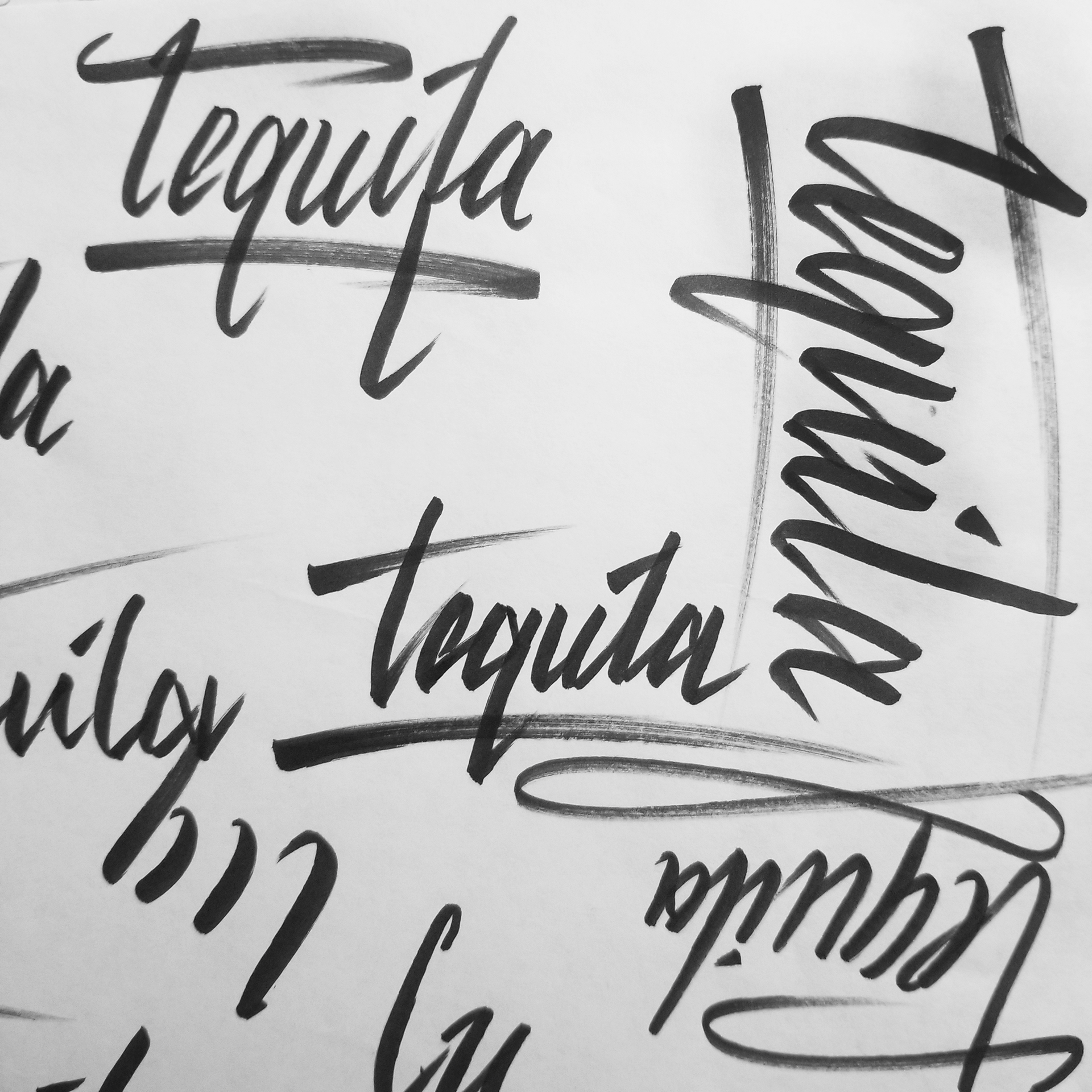
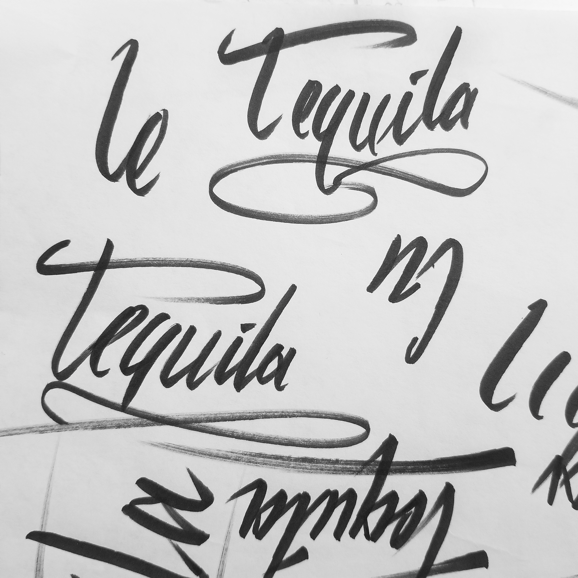
The initial concept was to create a logo that captured their several expressions while staying memorable, simple, versatile, and timeless.
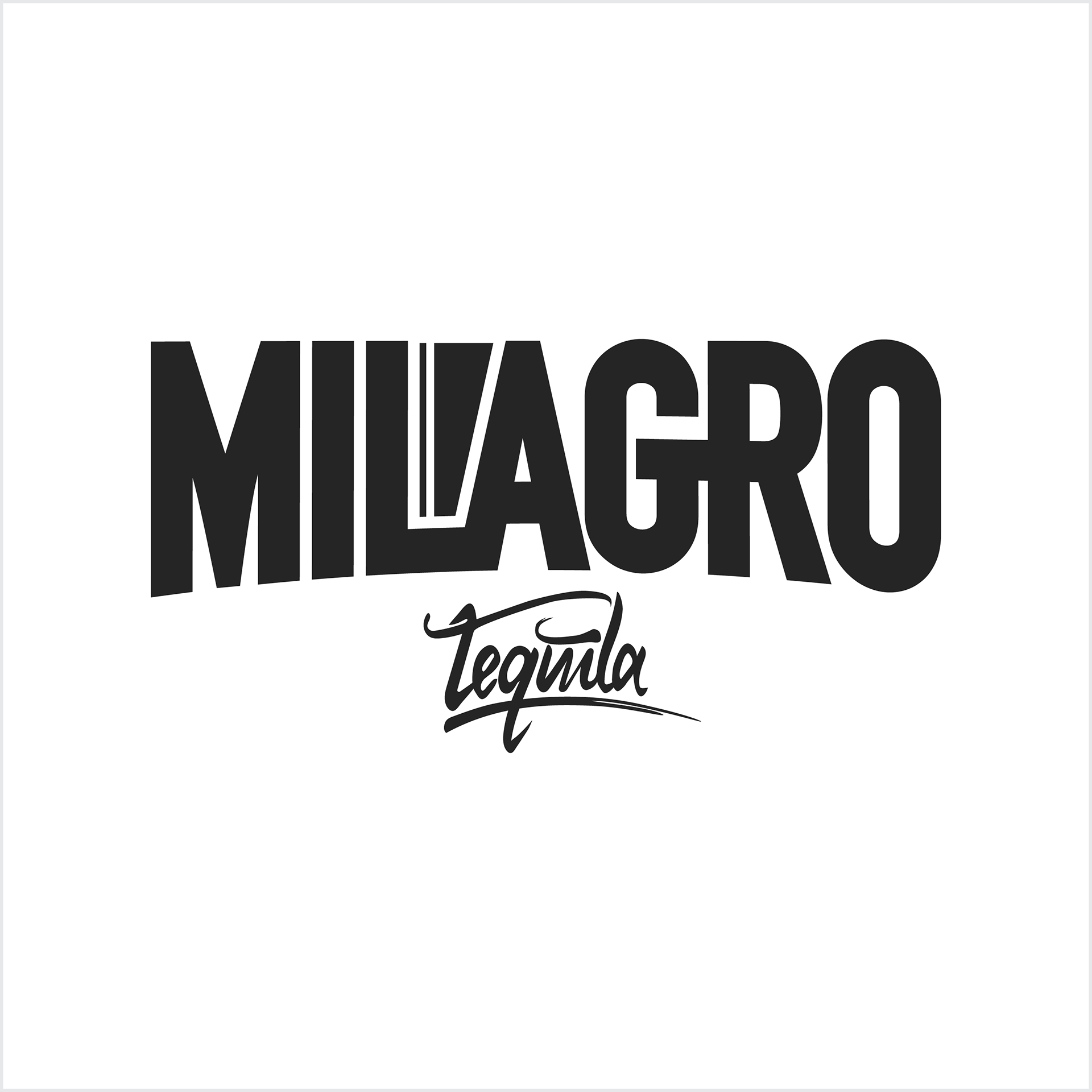
The result is a prominent ‘Milagro’ typeface contrasting a smooth ‘Tequila’ script. Together these attract the attention of customers, deliver the brand’s message quickly, and leave a first impression.
Package Design
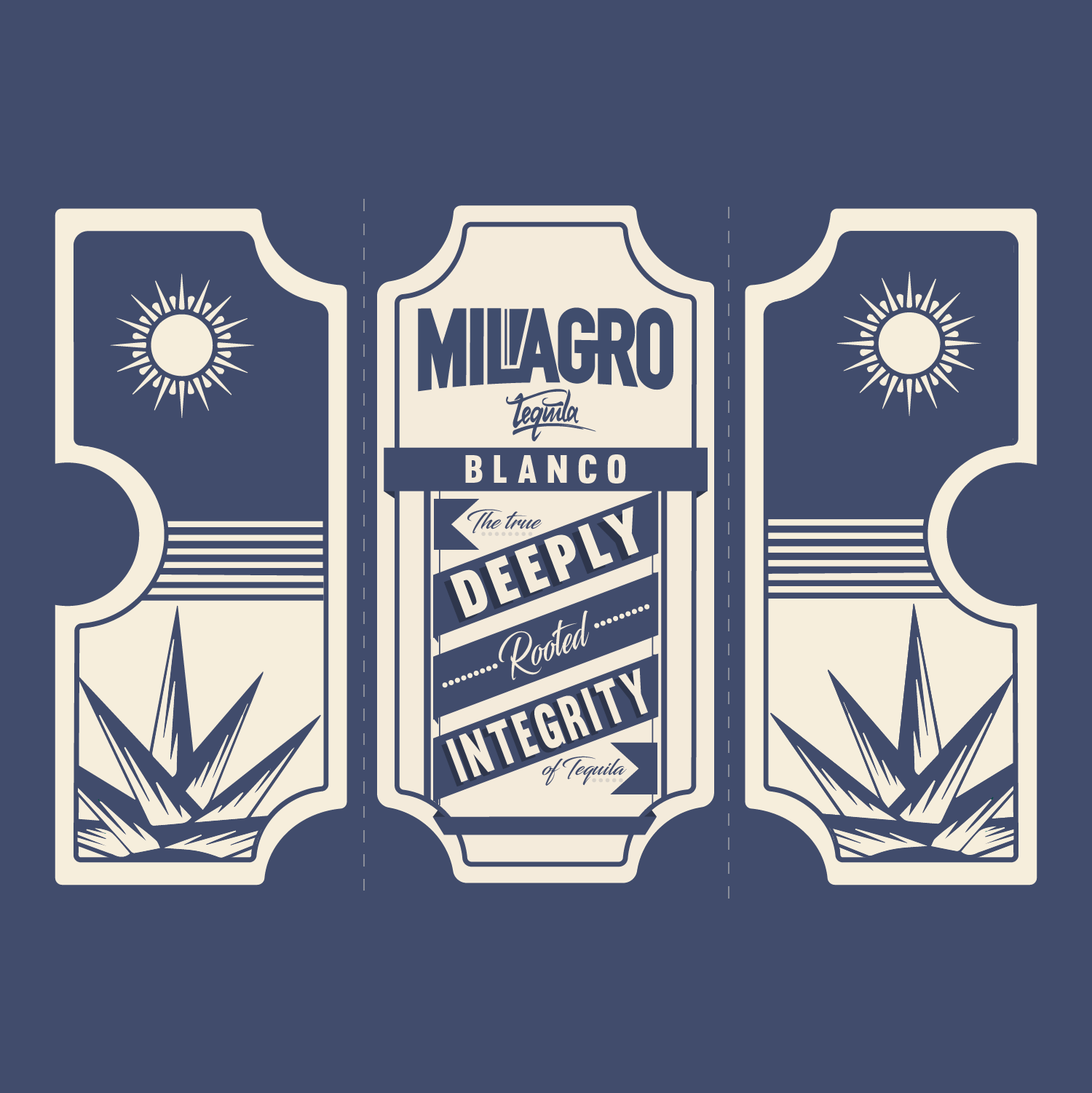
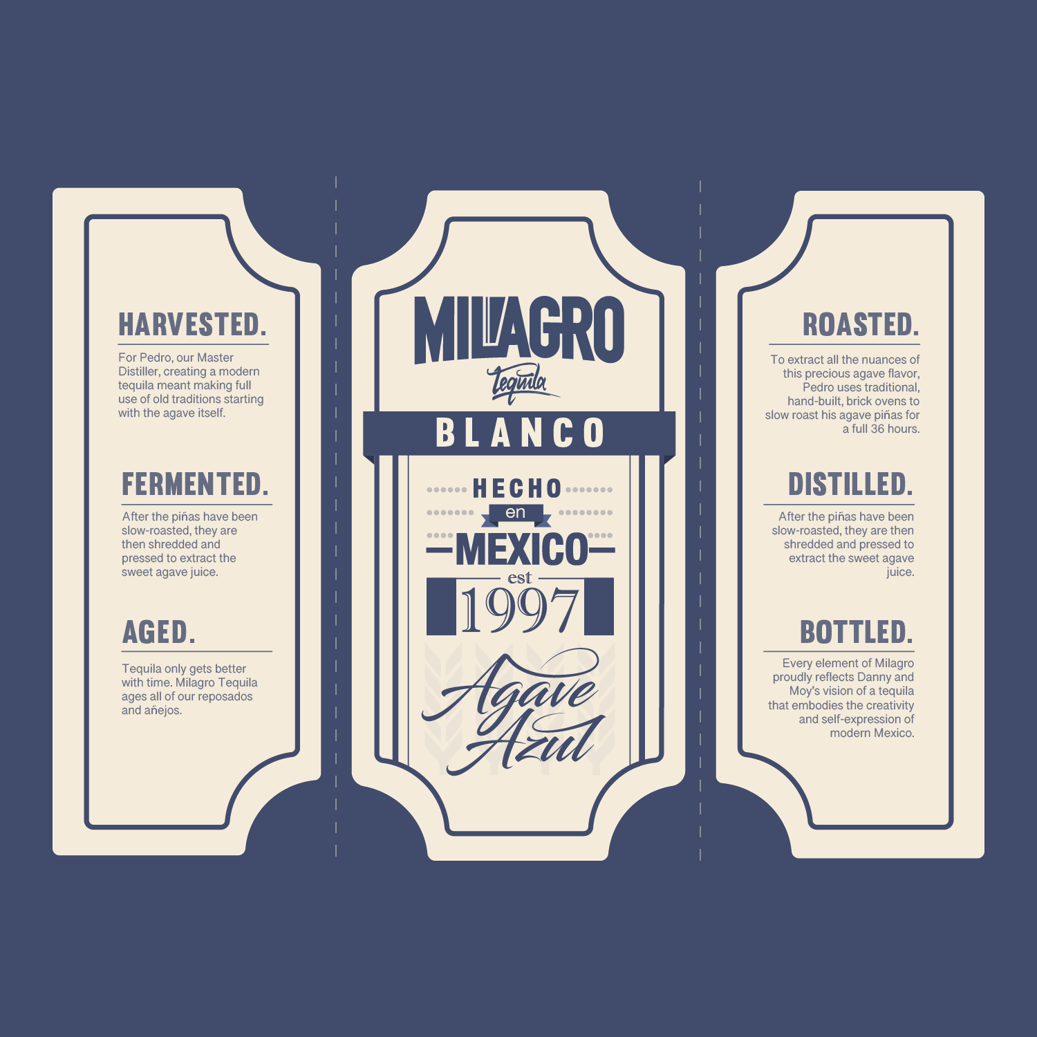
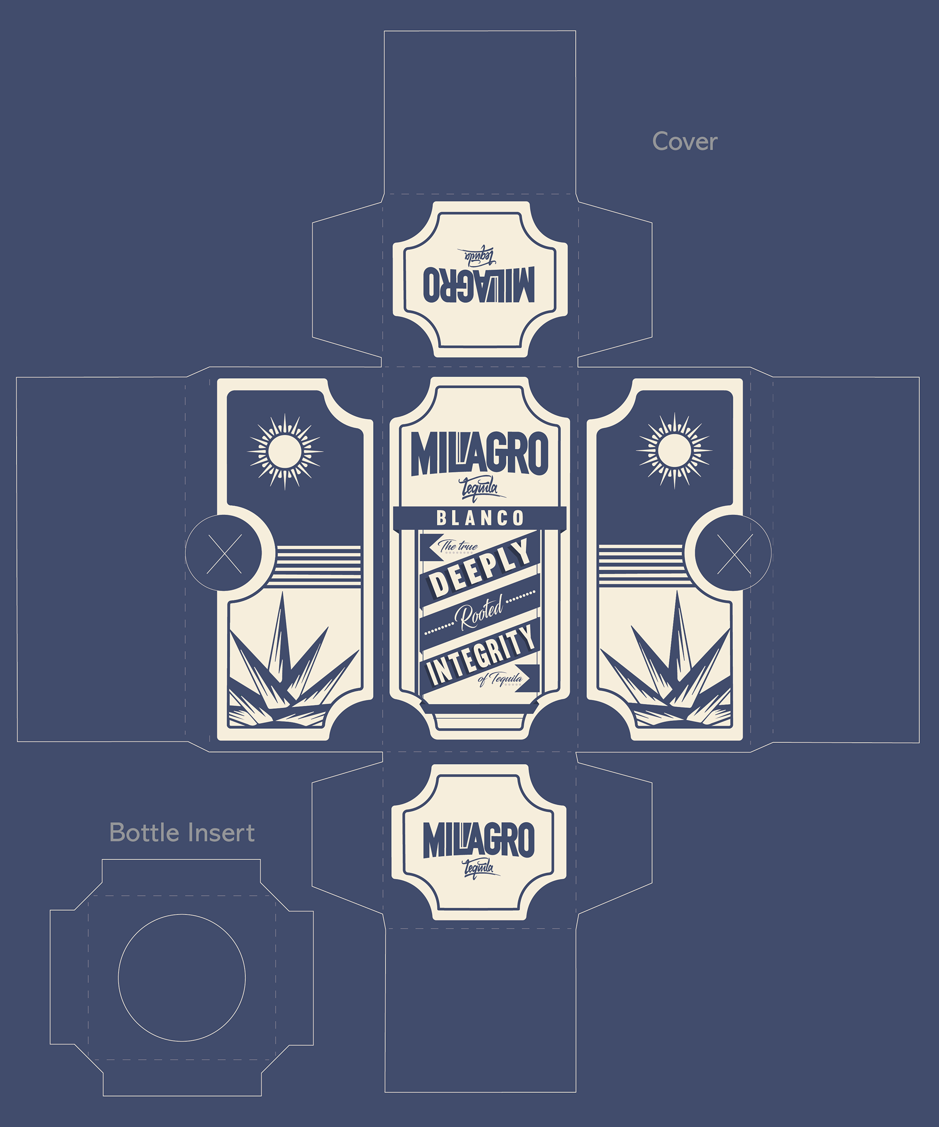
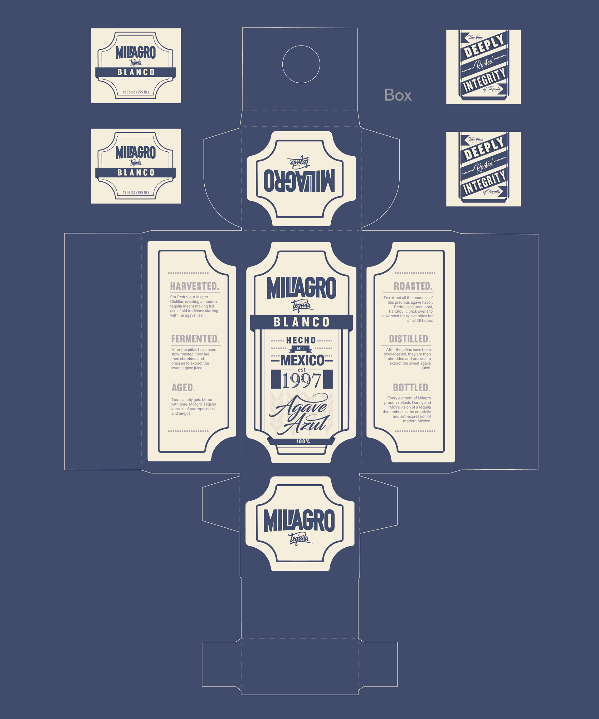
A box and cover with consistent artwork printed on all sides was designed to grab attention with its typographical representation of the brand’s core values.
The main function is to be recognizable from any side of the box when it’s displayed on store shelves. It's meant to hold a 12oz container should Milagro Tequila decide their eighth expression of tequila to come in a steinie-sized bottle.
