The mind behind the captured moments is Samuel Ortega, a talented photographer based in San Diego, CA. He focuses on portraits, lowriders, landscapes, and the Chicano Culture. 'Twisted Fate' started as a way to identify his images.
The concept was a brand that represented his idea of what photography meant to him; A multi-focused (twisted) form of art with an unpredictable destiny (fate). The first step to developing his brand identity was creating a logo.
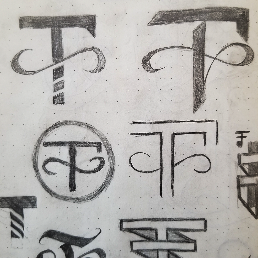
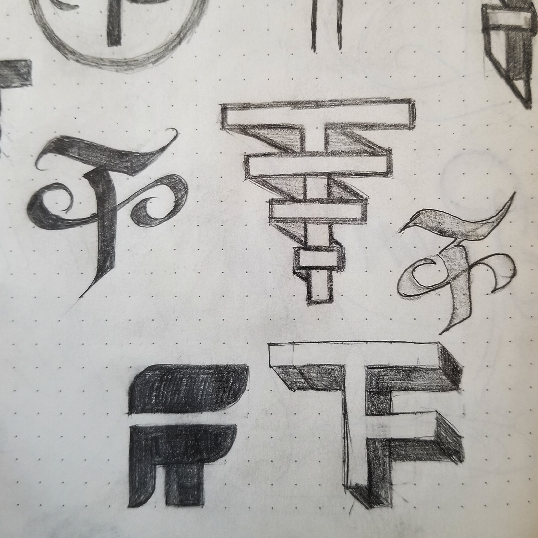
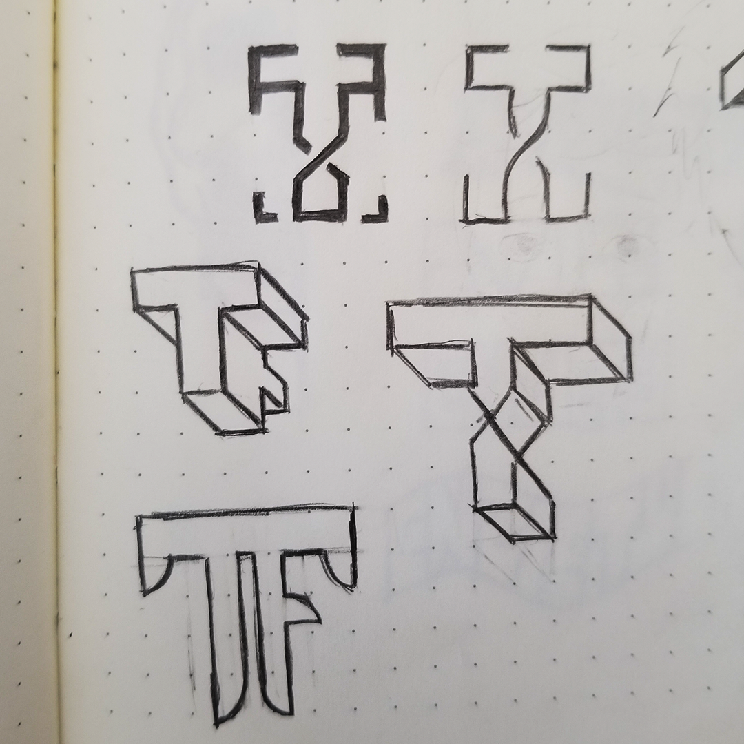
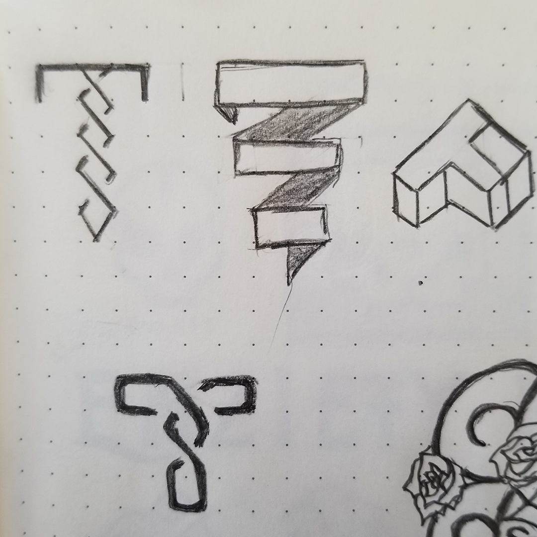
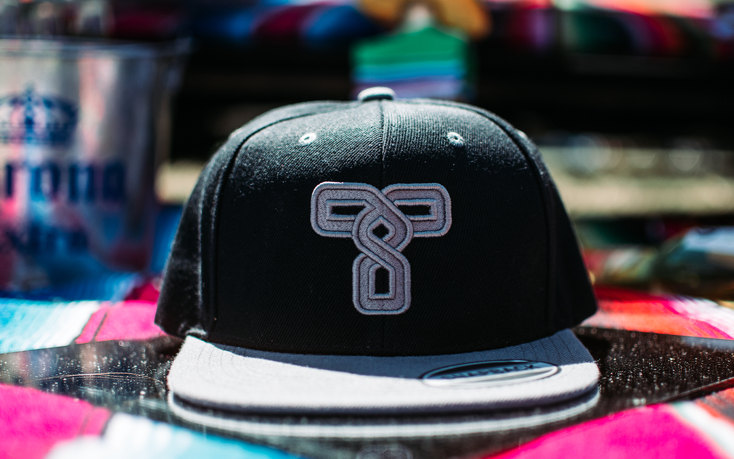
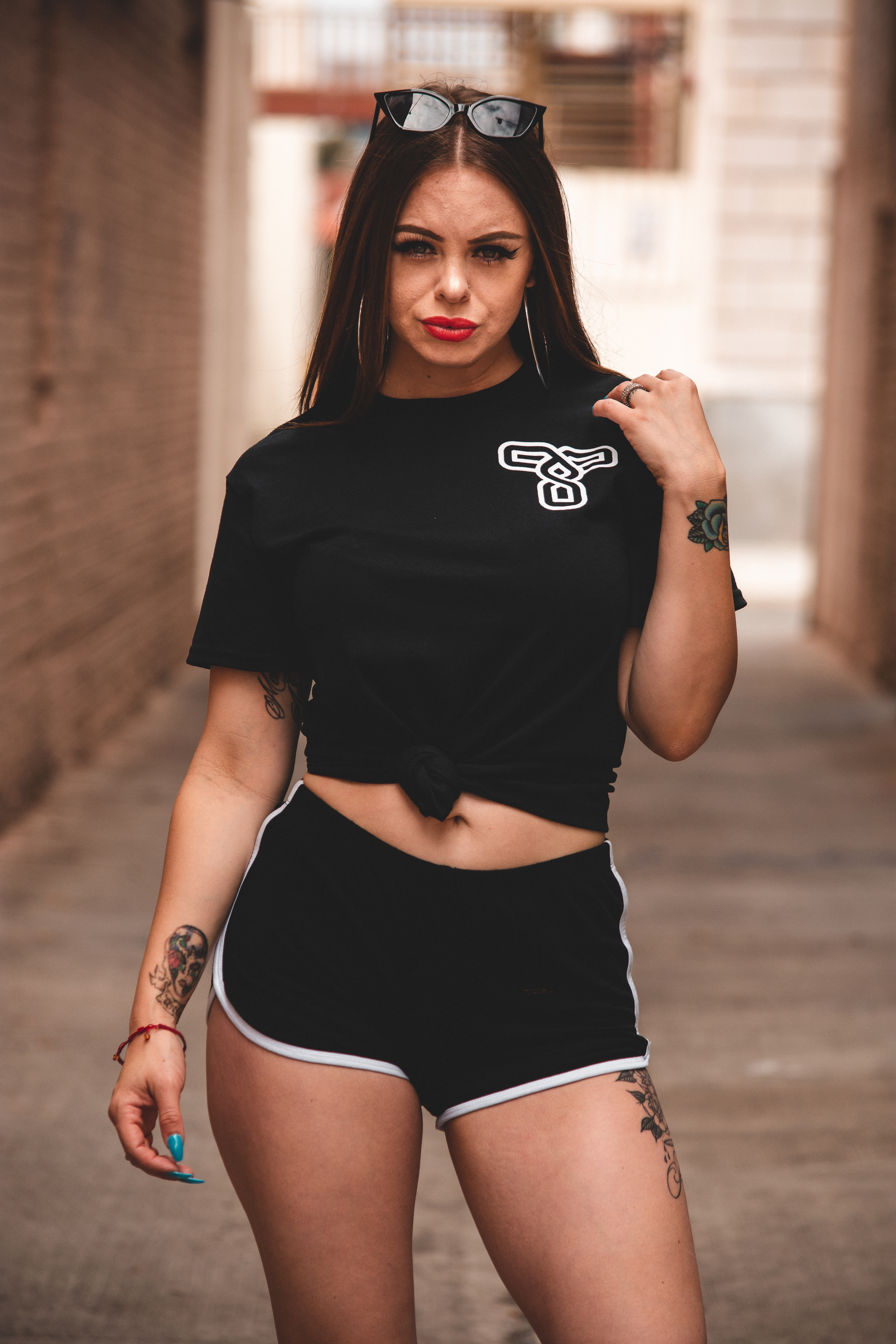
I decided to create a lettermark with the first initial of his brand's name. I implemented the 'twist' effect in the stylized outline of the characteristics of the the letter 'T'. The strokes are a metaphor for the paths and decisions that shaped his creative journey.
*Mock-Up Assets edited but not owned by me.
The brand name appears in a unique sans-serif type-face based on DIN. The strokes in the 'W' (Twisted) overlap each other meanwhile the crossbar in the 'A' (Fate) is replaced by a stroke.
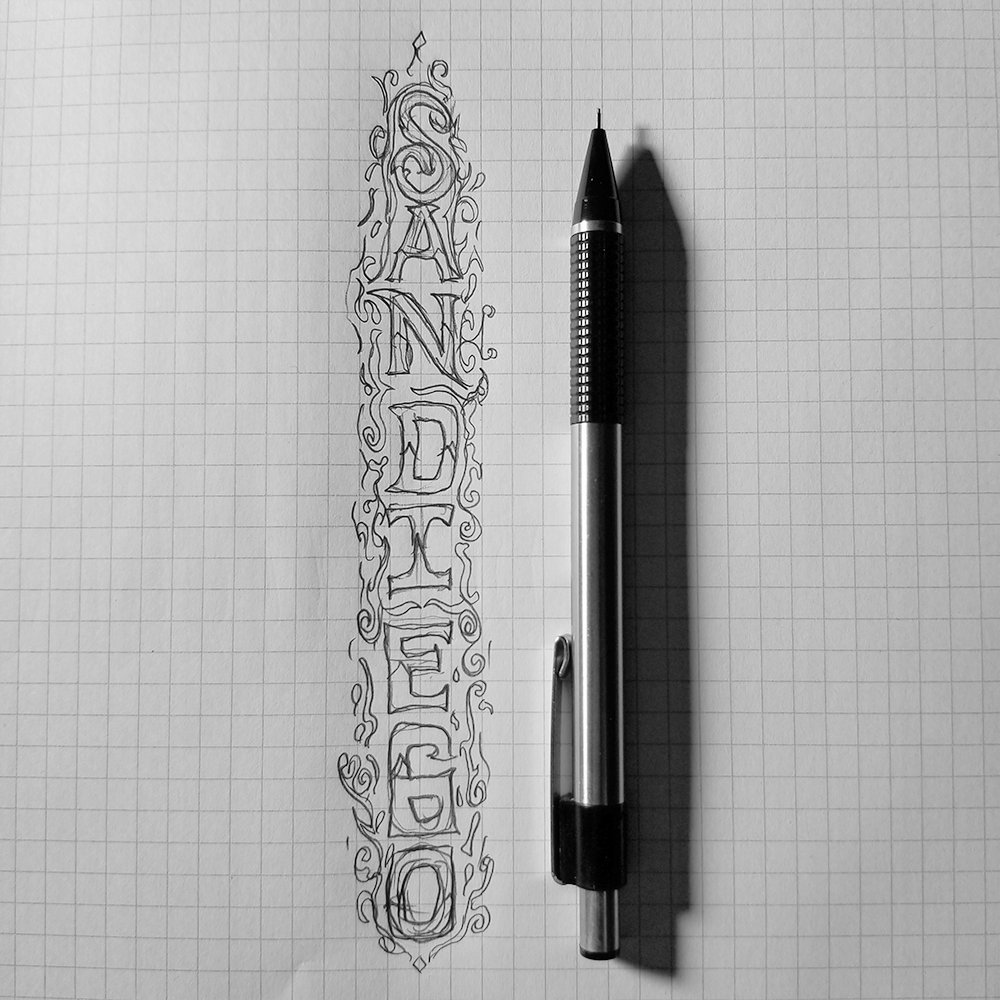
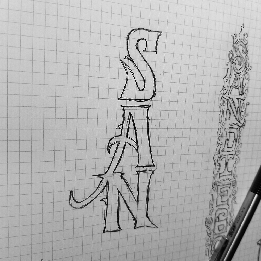
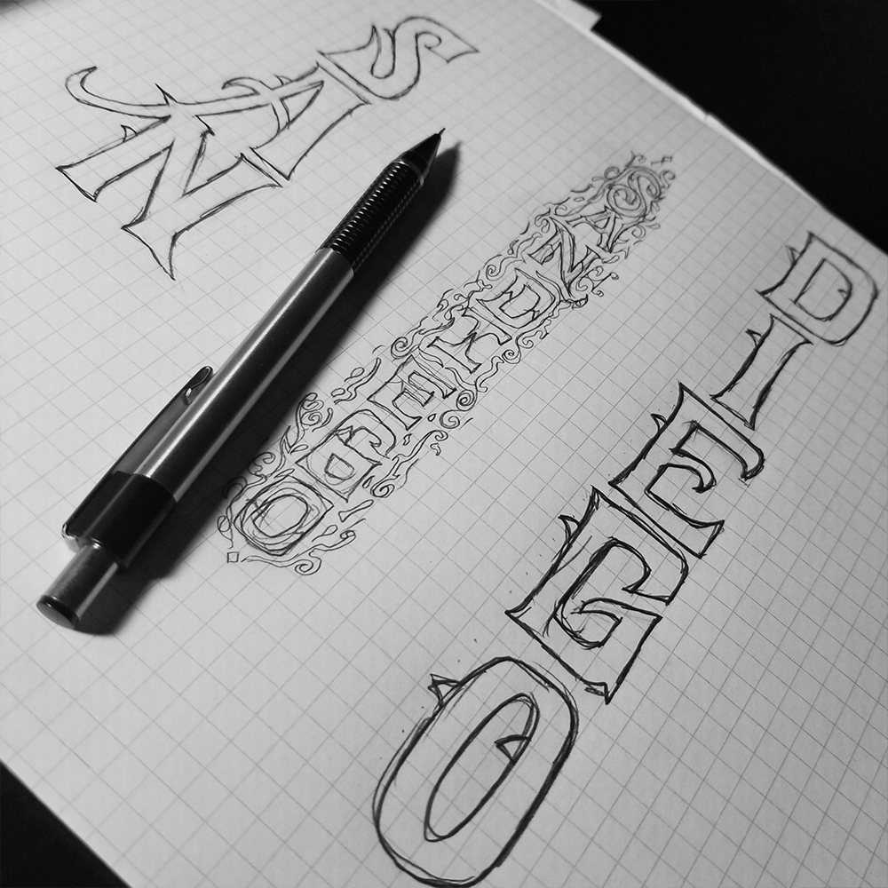
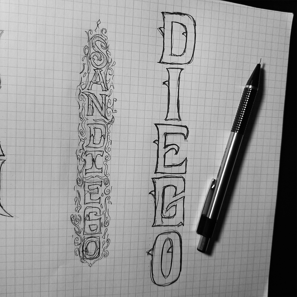
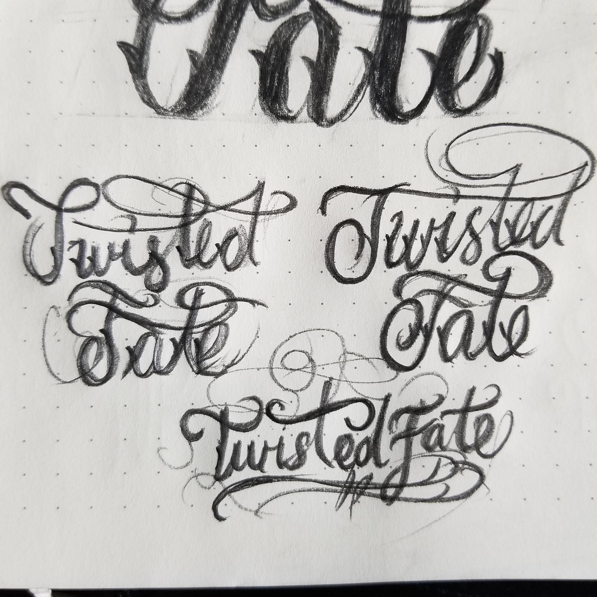
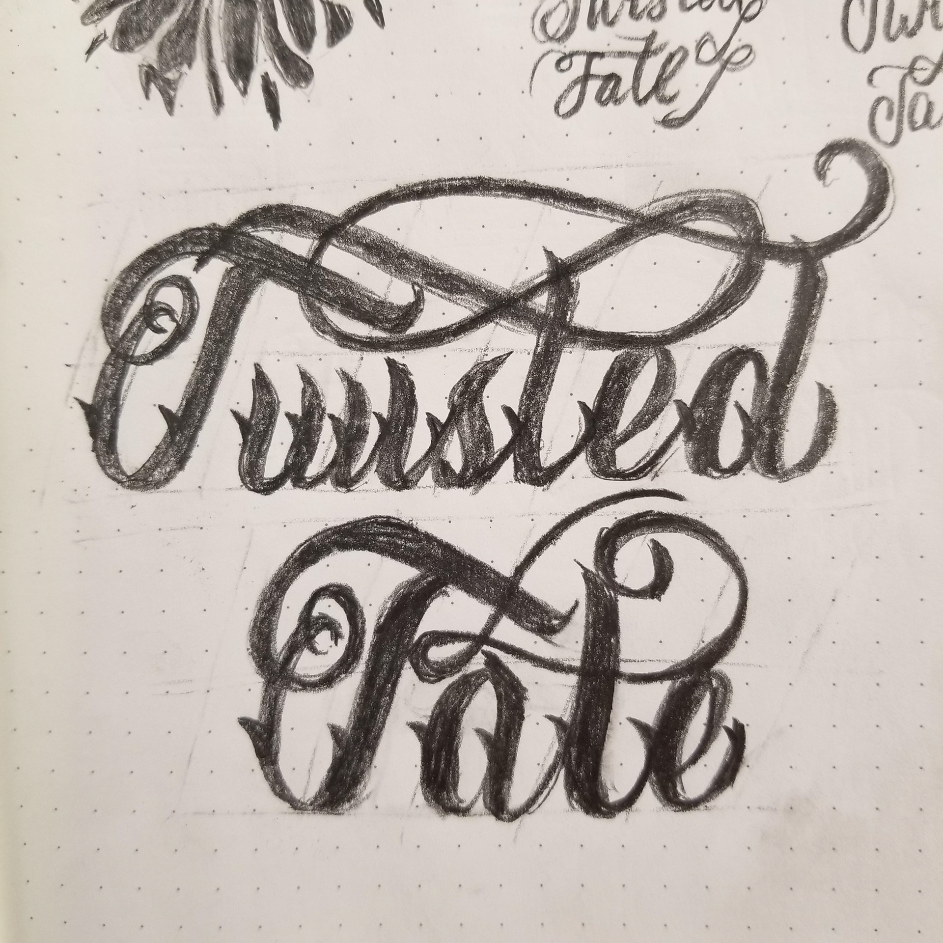
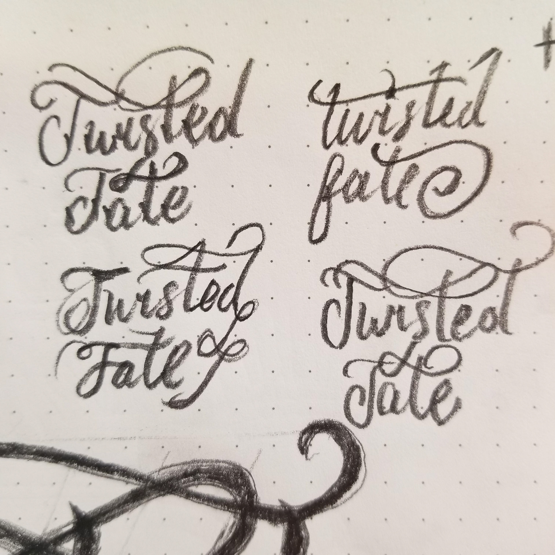
Script Lettering Design
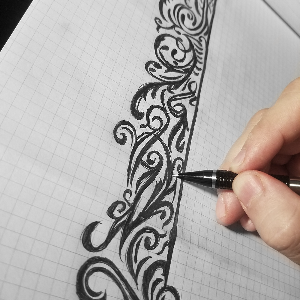
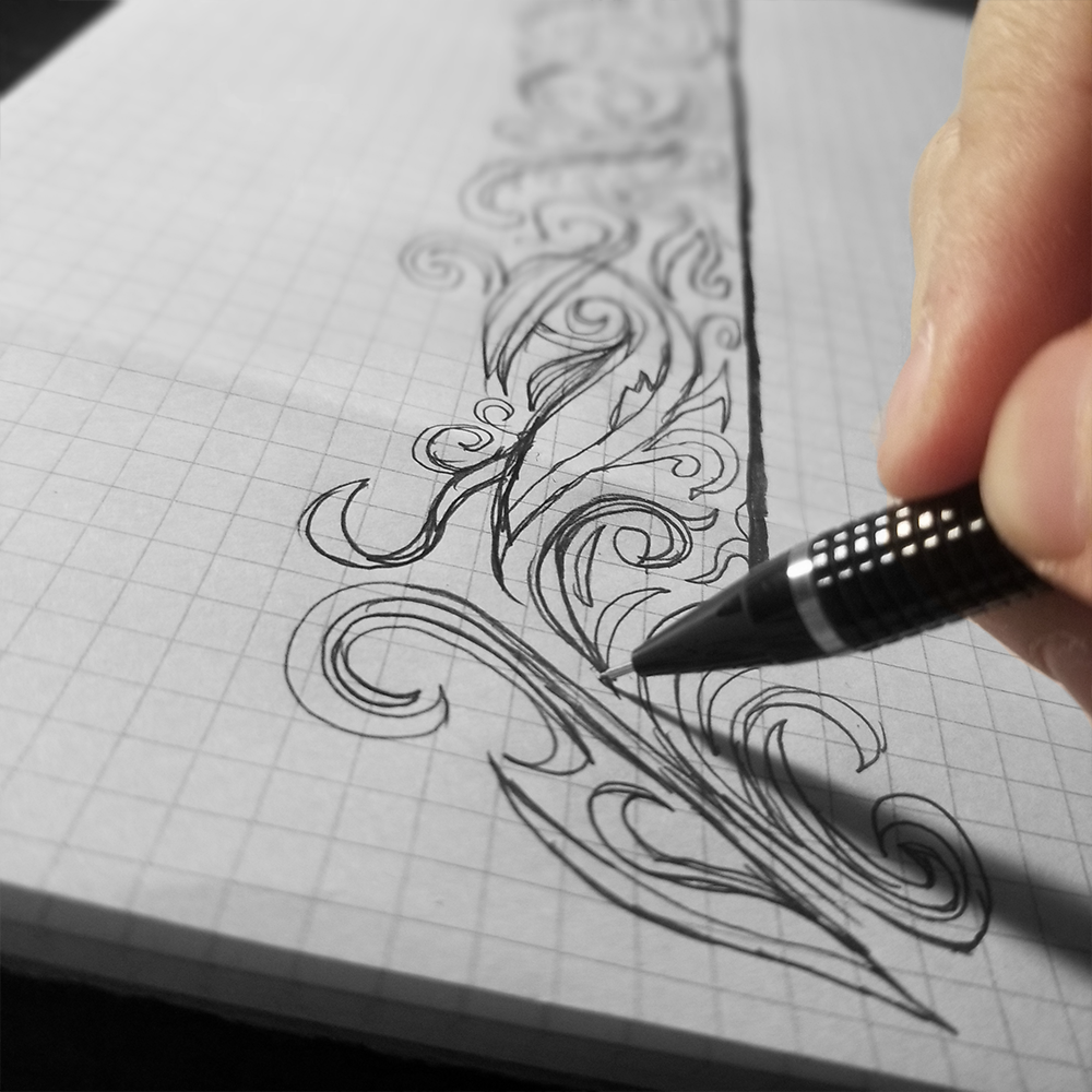
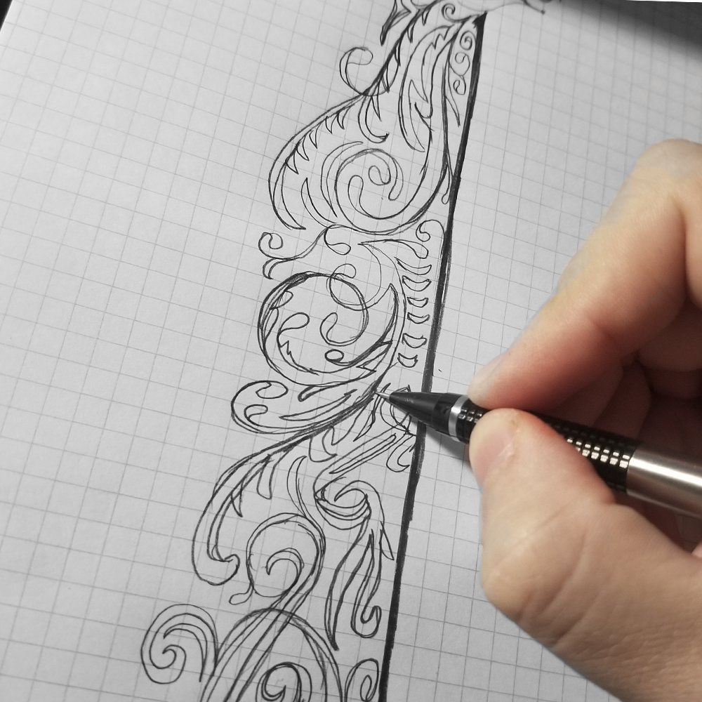
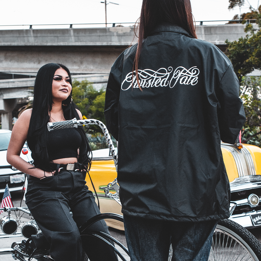
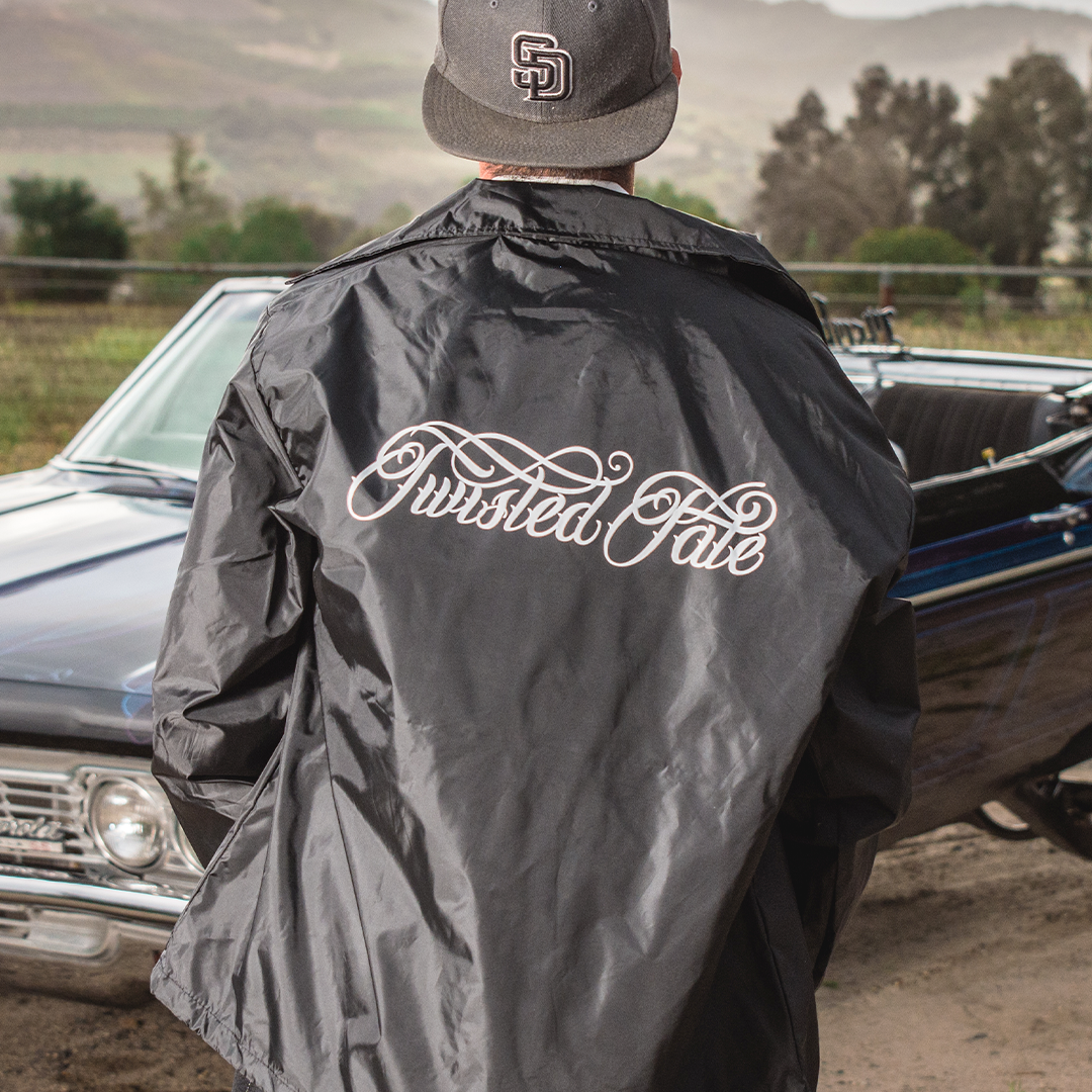
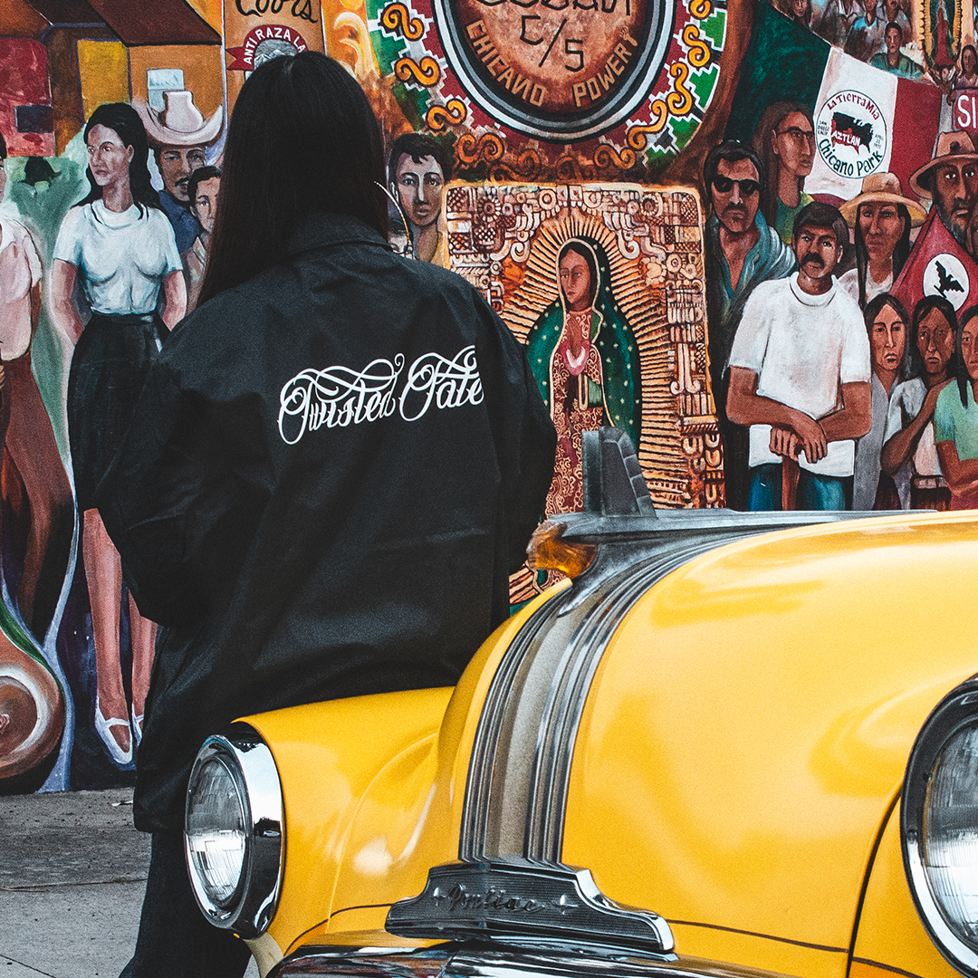
Inspired by lowrider art, this piece was made to represent Twisted Fate’s brand through the lens of the lowrider culture. Chicano art often combines portraits or lowrider cars with a word or phrase and we wanted to focus on its calligraphic lettering style that merges copperplate with elements of blackletter.
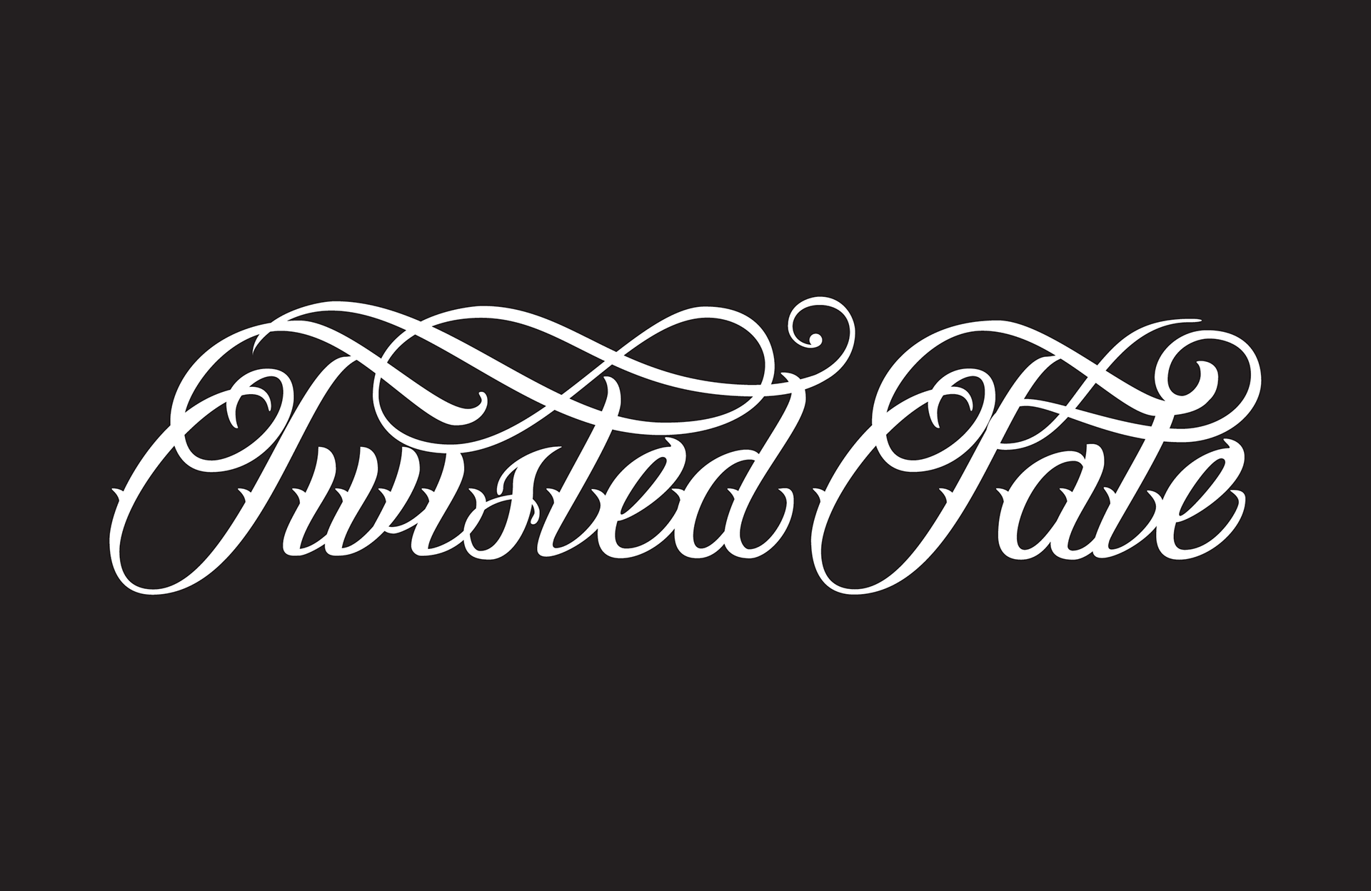
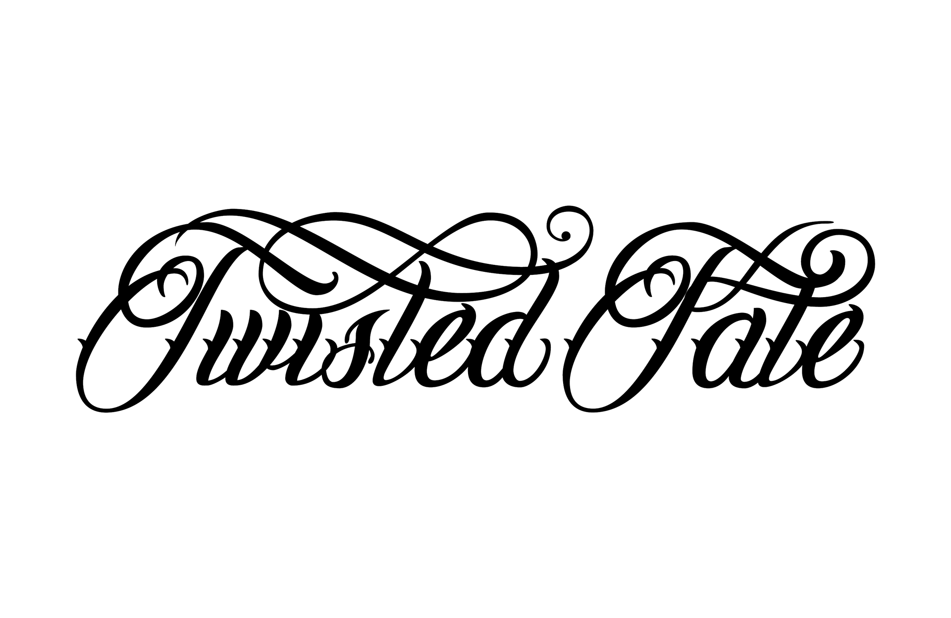
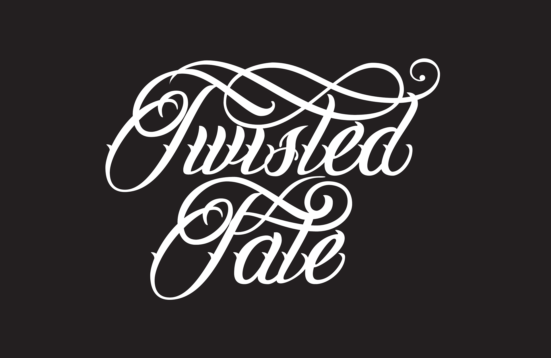
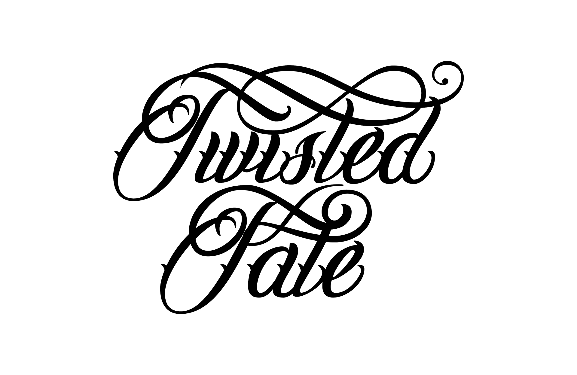
The elegant nature of flourishes compliments the structural balance of the strokes on each letter’s stem. Each crossbar is unique and carefully placed to balance the name in both a single line or stacked positions. The end goal is to print this design on Windbreaker Jackets and Sweatshirts.
Black Lettering Design
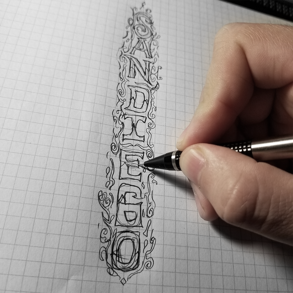
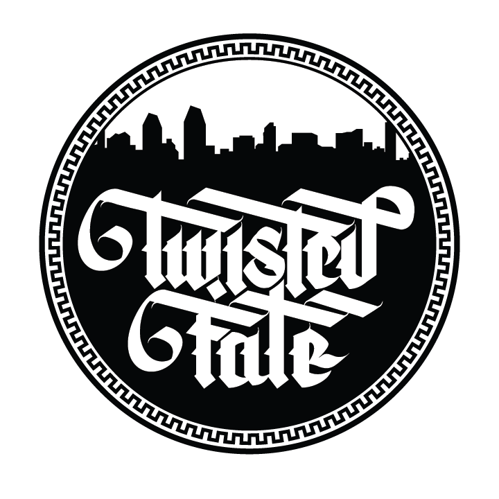
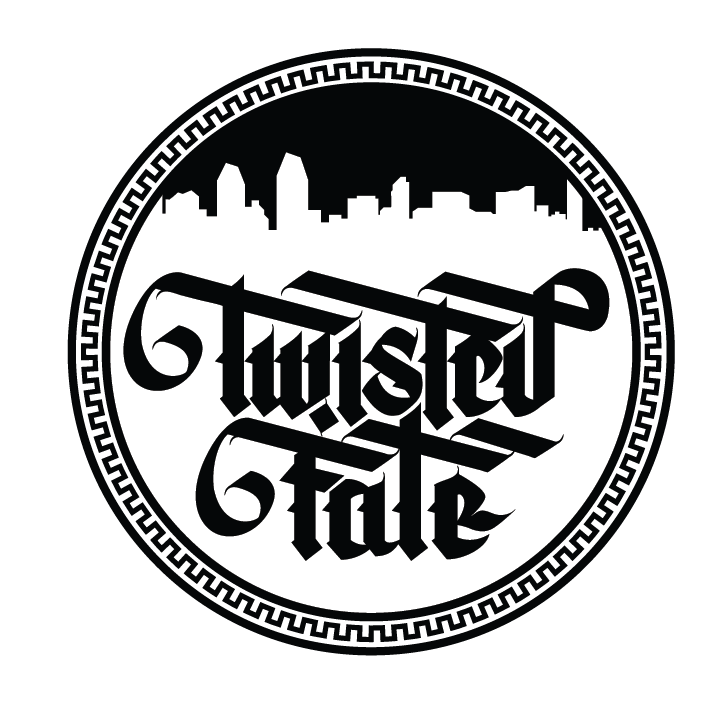
Samuel approached me looking for a stylized design for his brand. "I want to have a design with custom handlettering and something representing San Diego in the background". He proposed having the iconic San Diego skyline with blackletter inspired letters as the focal point.
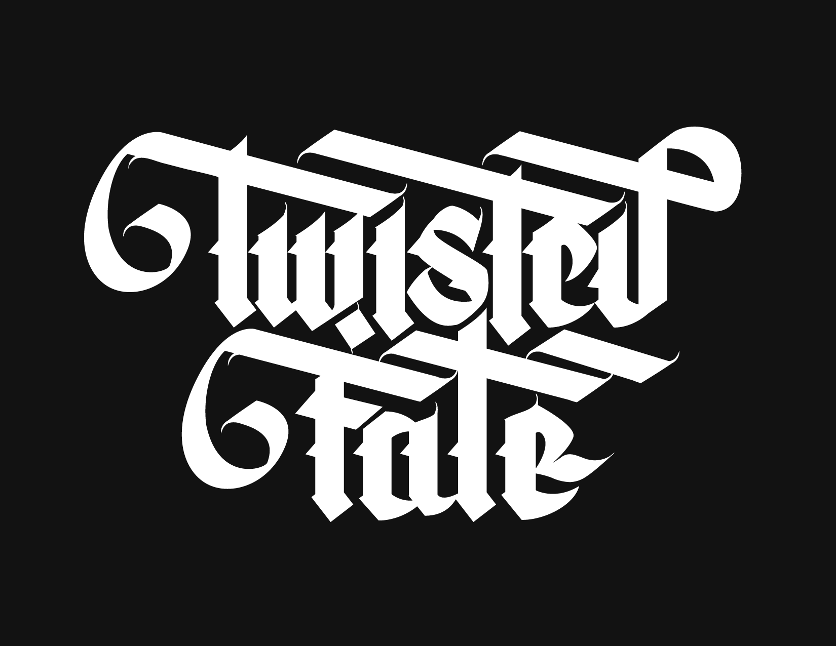
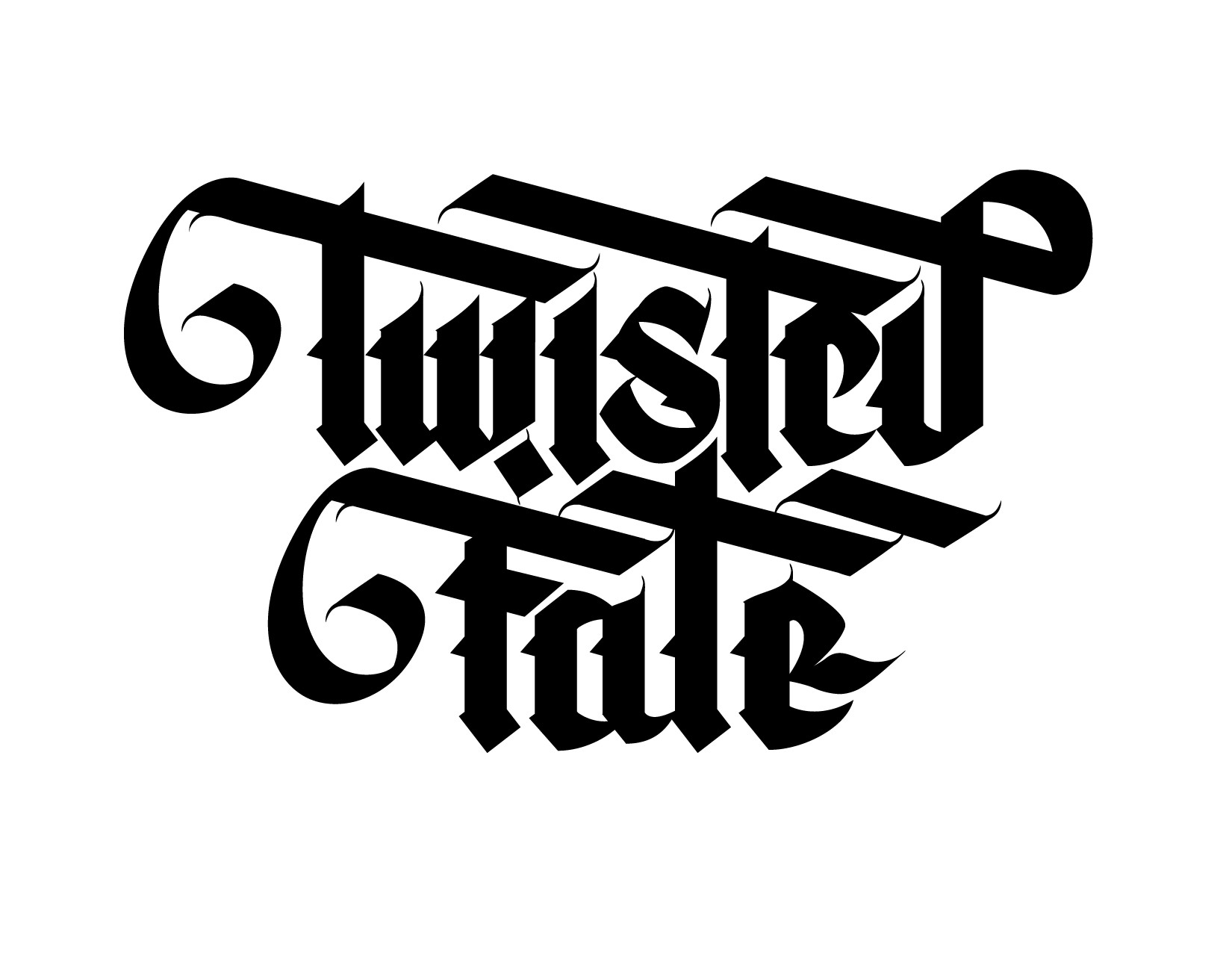
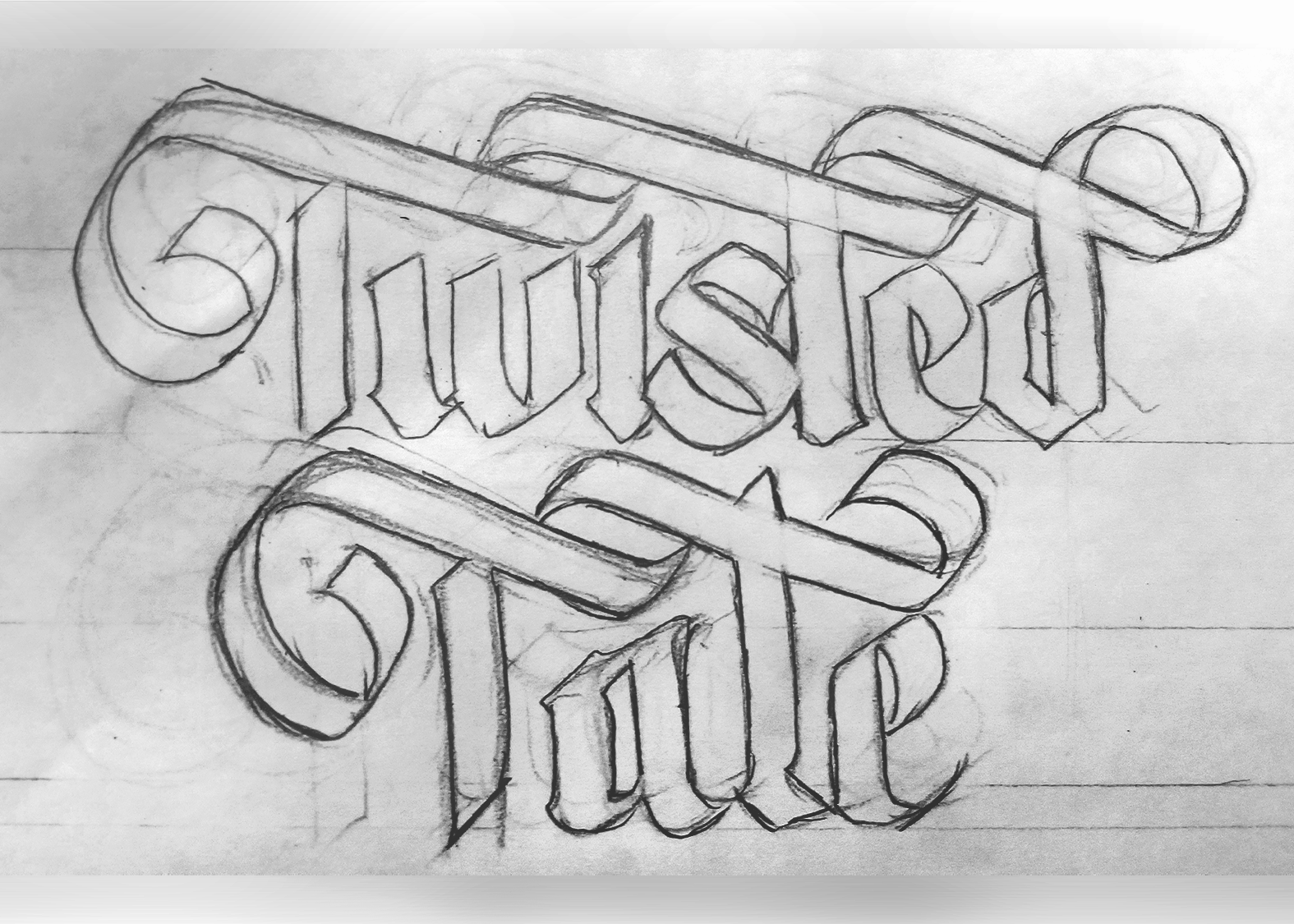
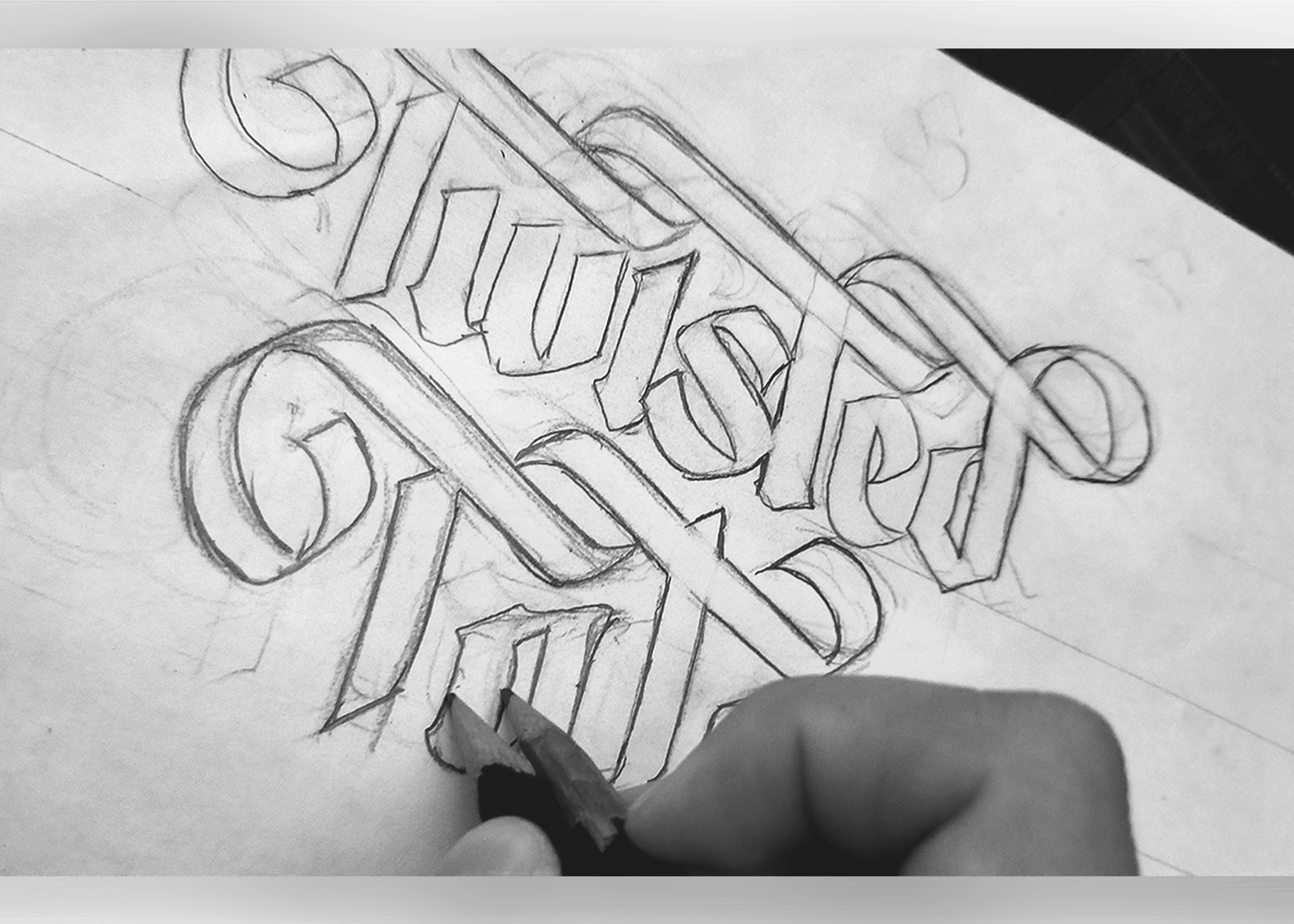
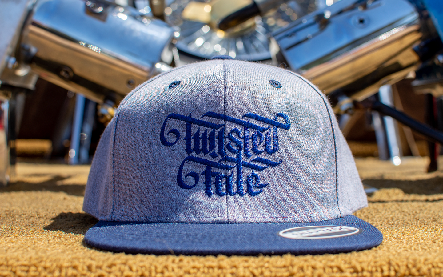
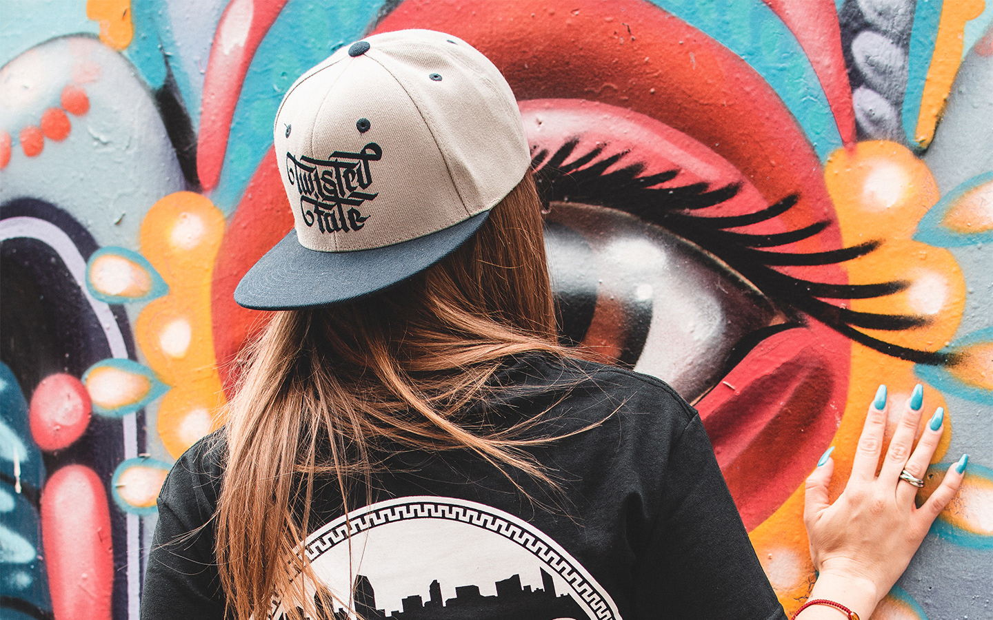
I sketched out multiple ideas that lead to this geometric/modern gothic style. After vectorizing the skyline, I combined the two inside of a circle. The finishing touch was the geometric border resembling the Aztec Calendar Stone, tying in his ideas of cultural and personal value into the design.
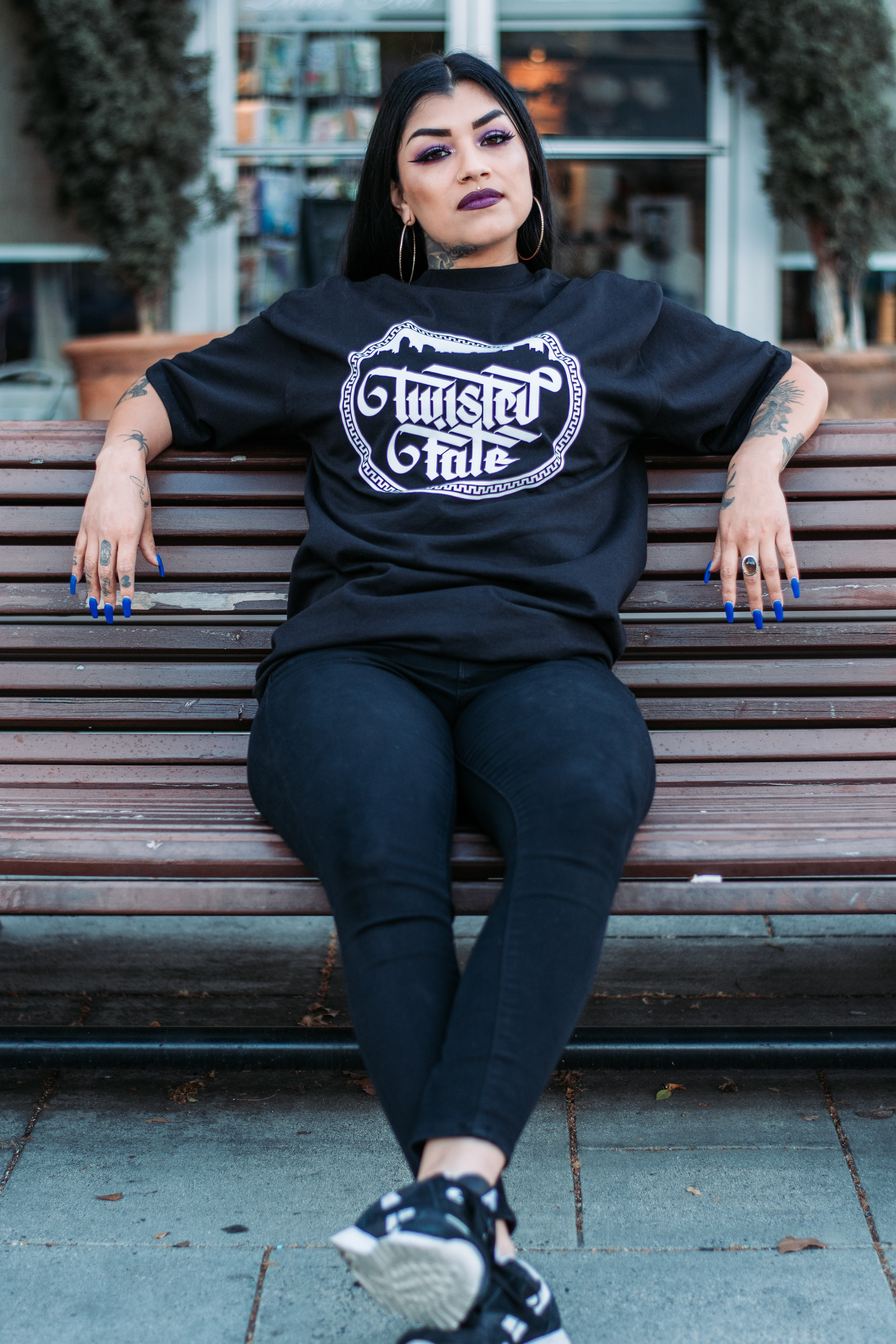
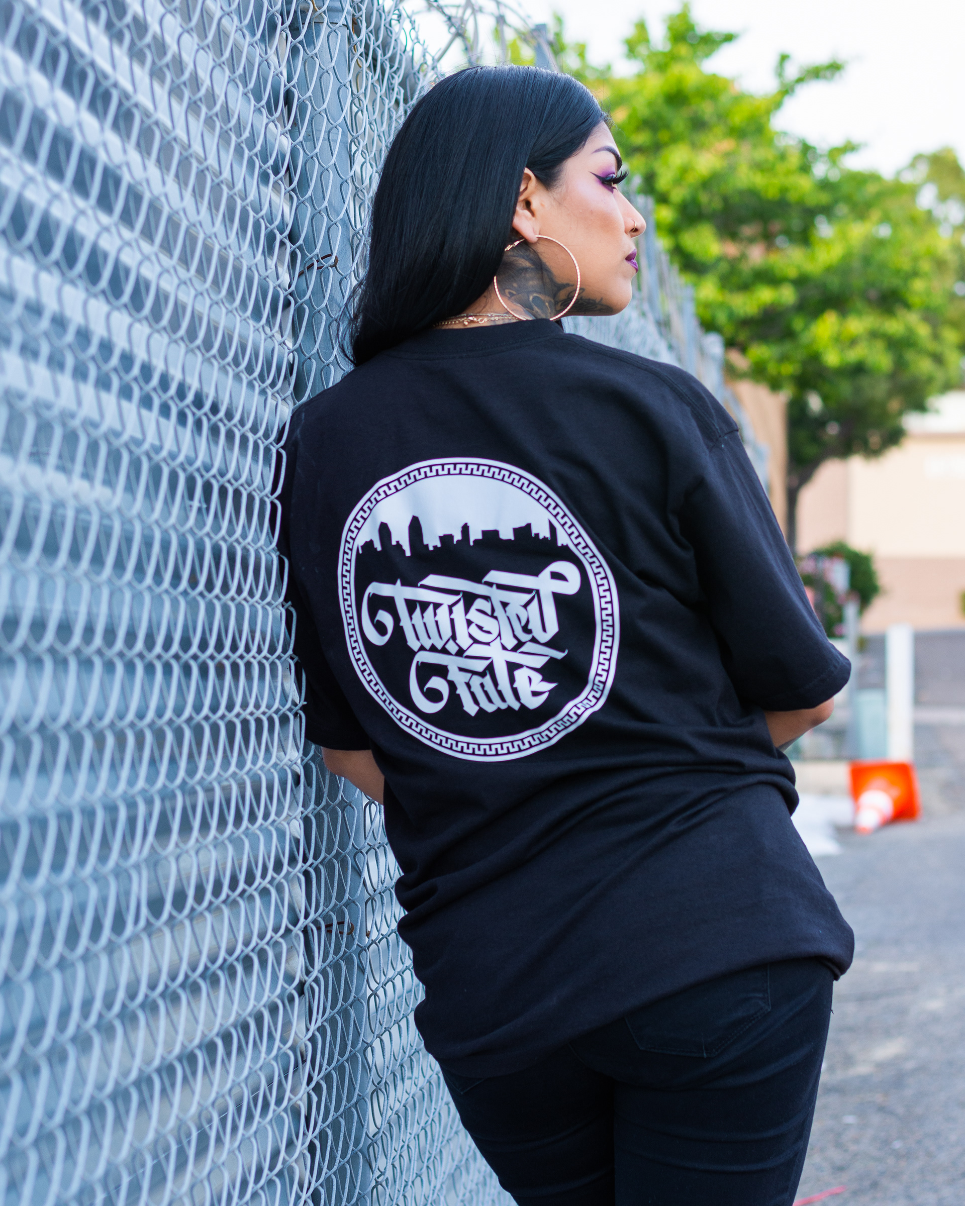
© TwistedFatePhotography
Support Your Locos
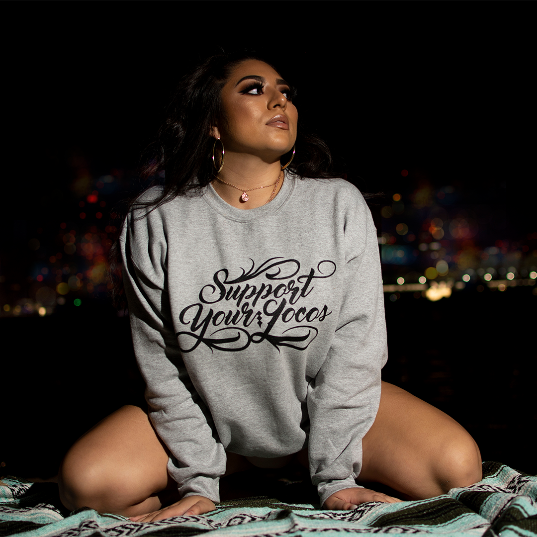
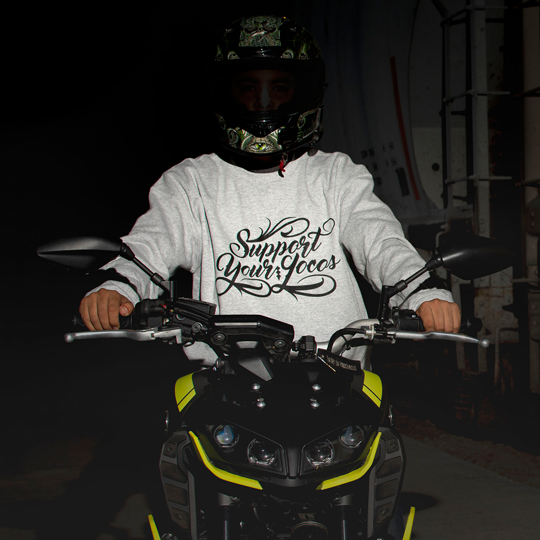
Once again Samuel had another project in mind. This time he wanted to work with wordplay of the phrase “support your locals” by replacing “locals” with “locos”. The goal was for this design to be printed on sweatshirts and eventually on t-shirts as well.
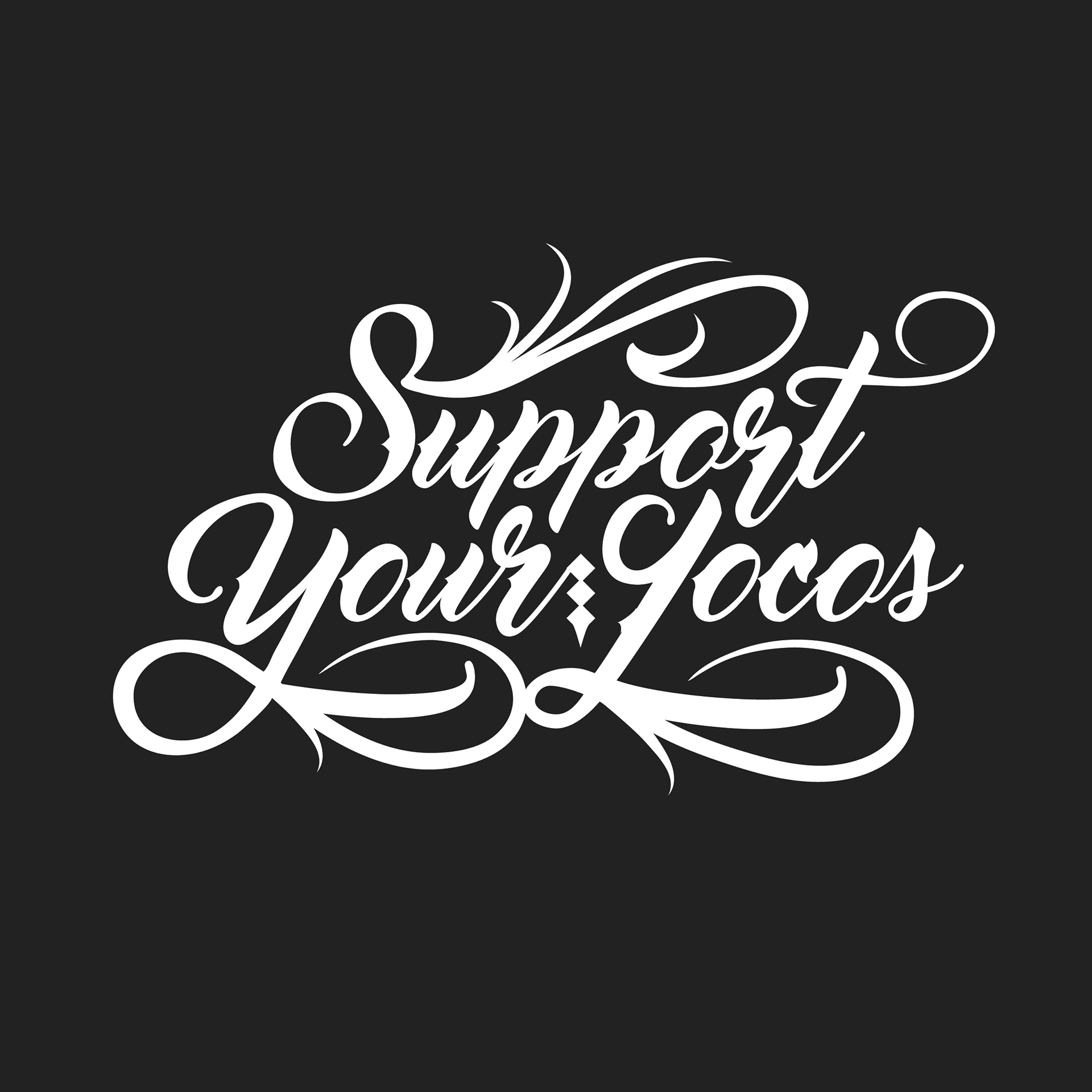
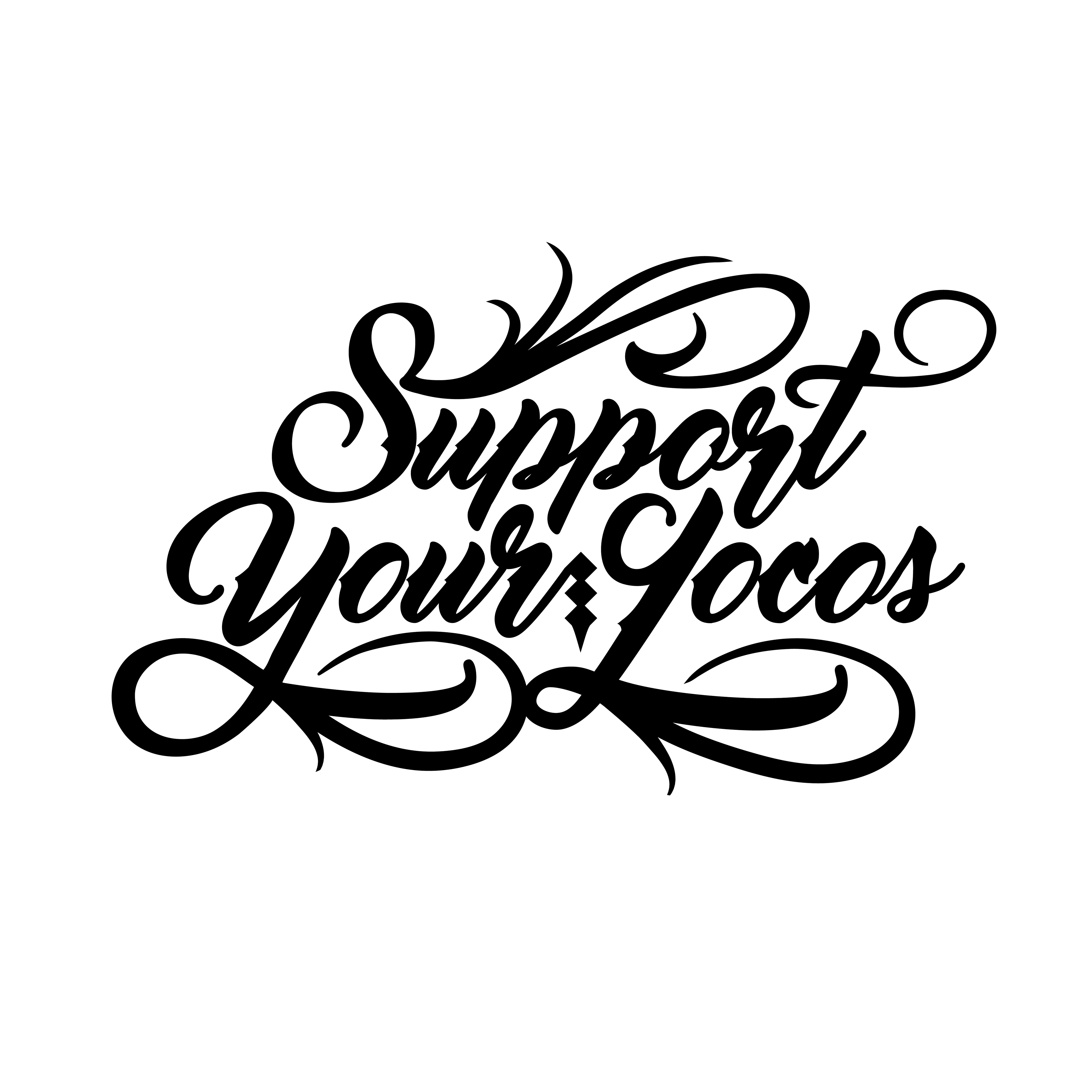
He was looking for a calligraphic style leaning towards copperplate mixed with brushscript. So I started sketching and the result was a smooth depiction of swirls with attitude.
